
Learn how smart design can boost engagement - and how small changes can unlock big shifts in attention, effort, and impact.
We’ve all been there. Crowded interfaces and confusing pathways don’t exactly inspire confidence in training material. And they can make the user tune out faster than you can say ‘mandatory compliance manual’.
But well designed learning makes people lean in. Which means they remember more, apply it faster, and they’re keen to come back for more. Here’s how to make digital learning engagement flow.
Be Captain Obvious
Digital learning shouldn’t feel like a scavenger hunt. When learners have to guess their way through a module, they’re burning brainpower.
What good looks like:
Clear, consistently placed navigation
Predictable interactions (Next, Back, Menu, Resources)
Labelled buttons that tell you exactly what’s behind the click
Minimal scrolling – especially on mobile
Quick tip: If your team has to give learners a walkthrough on how to use the module, the UX is in Struggletown.
Break it down
When it comes to digital user engagement, the structure of your content matters. Organising ideas into meaningful, digestible chunks, gives learners space to absorb and apply what they’re seeing.
Here’s how we do it:
Use headers, bullets, and visual cues to guide attention
Group related ideas together (don’t bounce between topics)
Keep screen content focused on one key message at a time
Use animations or transitions to pace delivery without distraction
This structure is clean, but it’s more than that. It reduces cognitive overload. And less overload means more energy for actually learning.
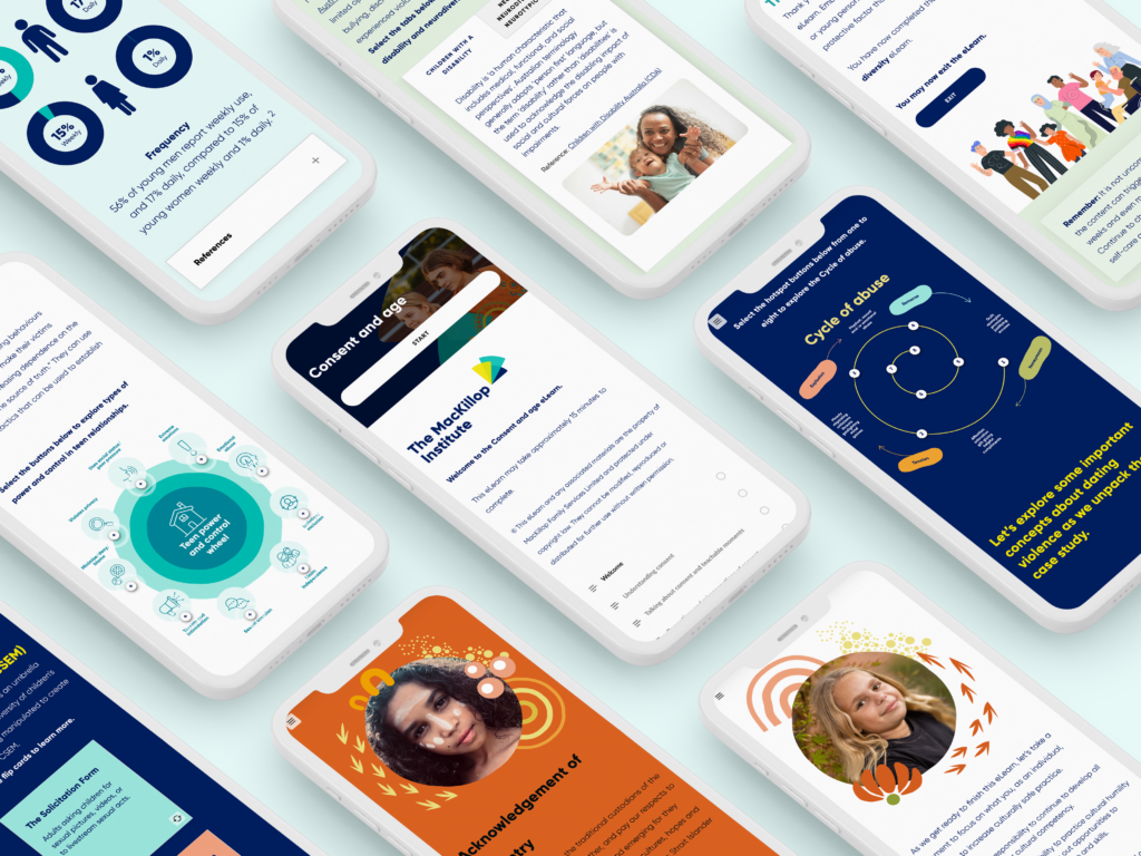
Swipe right on mobile
A growing chunk of workplace learning happens on mobile. Whether it’s in the field, during a commute, or between meetings, people are reaching for learning that fits into their day.
UX must-haves for mobile-first learning:
Responsive layouts that flex across devices
Tap-friendly buttons (and no tiny links in corners)
Short screens with clear calls to action
High contrast for readability on any background
In our work with frontline teams in logistics and utilities, we’ve seen how accessible design directly drives uptake. Modules that look right and work right on mobile get completed more often – and revisited more often.
Make space for learning
It’s tempting to fill every pixel with content. But restraint is a design superpower. White space creates visual breathing room, which helps learners process, reflect, and prioritise.
Here’s what we recommend:
Use visual hierarchy to draw attention to key takeaways
Resist the urge to “justify” every screen with more text
Let imagery support the message – not compete with it
Digital learning engagement without the guesswork
If you’re already thinking about how to make your learning more engaging, you’re asking the right questions. And we’ve got all the right answers.
The Digital Learning Design Playbook is packed with smart, field-tested ways to build digital learning that people lean into. Inside, you’ll find design principles, UX tips, and a full framework to make your digital learning work.
If you’re ready to roll, you could always book us by giving us a call on 1300 162 393.
We’d love to help you bring your next digital project to life – strategically, practically, and with your learners in mind.
Hungry for more?
Related blog articles:
- The Digital Learning Design Playbook
- Get the most from your eLearning tools with smart design
- Creating Engaging Rise 360 eLearning with a Canva Twist
- Facilitation tools to enhance virtual workshops
- How to Design Effective Microlearning Experiences for Adult Learners
- How to Create Interactive eLearning Content for Adult Learners