
Let’s talk about how your learning looks.
Because it matters more than most people think.
When people see poor visual design, they tune out. When design works, they lean in. The evidence is piling up, and it’s not coming from art blogs or Pinterest boards. It’s coming from hard data.
What the research tells us
A study by Ghai & Tandon (2022) dug into what visual elements actually make e-learning usable. Turns out it’s not about wild colour palettes or abstract animations. The things that moved the dial were:
Typography (how the text is styled and spaced)
Layout and grid (how the content is structured)
Graphics (used with intent, not slapped on)
Consistency (same rules, same signals, across screens)
Colour and compositional theory didn’t do much on their own. Which means that cool gradients and neon buttons won’t carry your message unless they’re paired with strong layout and clear structure.
Want more proof? Clark and Mayer’s work on multimedia learning has shown for years that people learn better when visuals are tied to how we think—not just how we scroll. Use pictures and words together. Align visuals to what you want people to remember. Strip out anything that adds noise. This is how people learn faster and hold onto it longer.
And if you’re designing for modern learners (which, let’s face it, you are), another study by Nordin, Singh and Mansor (2020) showed that learners in their 20s will judge a course by its layout before they’ve read a word. If it looks messy, it gets ignored. If it’s clear and clean, they’ll stick with it.
That’s not about being picky. It’s about cognitive load. If your learners are spending mental energy figuring out where to click, or how to read a messy slide, that’s brainpower they’re not using to learn.
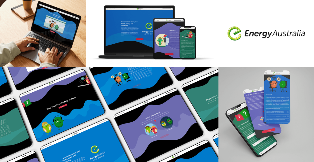
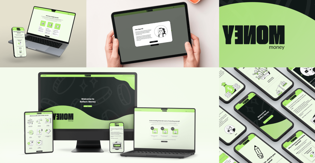
How we apply visual design at Hungry Minds
Simple. We use design to guide, not distract.
Every decision is made with the learner’s mental energy in mind. Design that’s clear and intentional helps people learn faster, with less effort.
Here’s what that looks like in practice:
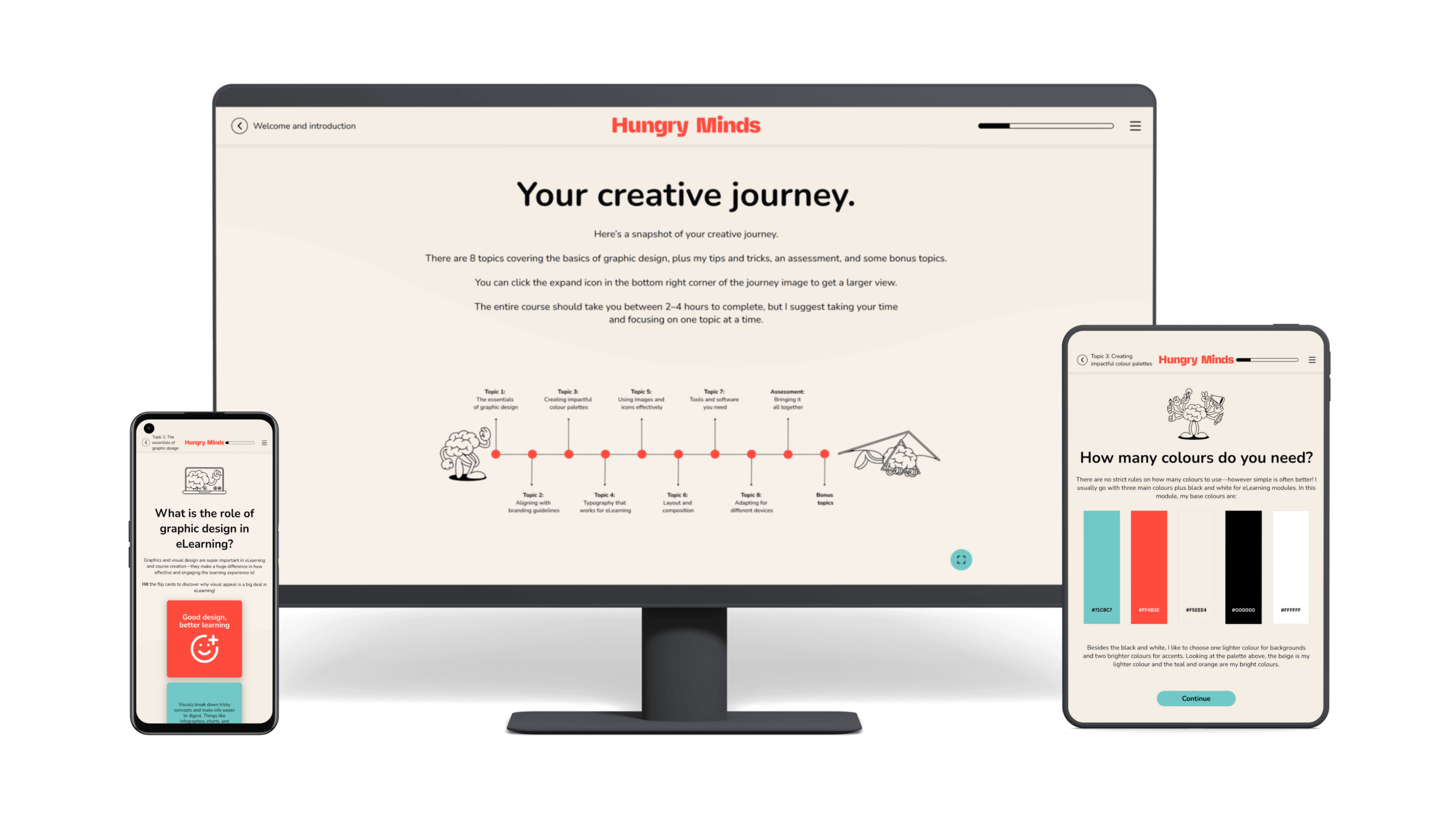
Typography comes first.
We don’t squish text into awkward shapes or stack five fonts on one page. We use type to build rhythm. To guide the eye. To support scanning and deep reading. Good typography does more than look neat—it helps people absorb ideas without friction.
Layouts support focus.
Before we build anything, we think about what needs to happen on each screen. What’s the one thing we want the learner to understand here? Then we build the layout around that. Every section earns its place. White space isn’t wasted space – it’s breathing room.
Graphics carry meaning.
We use diagrams, icons, illustrations, and photos when they support understanding.
Here’s how that plays out:
Need to explain a process? We’ll use a diagram to show the flow.
Got a complex decision point? We might build a branching graphic or icon-based visual to map it out clearly.
Teaching a physical skill or action? We’ll choose high-quality photos or illustrations that model it step by step.
We also think about visual consistency across a course. Repeating icon styles, colour logic, and graphic types helps learners quickly recognise patterns and build familiarity with the interface.
We design for fast brains.
We know people are scanning, jumping, filtering. So we don’t slow them down with clutter. We break up content, group ideas visually, and use cues like arrows, lines, and contrast to pull focus where it counts.
Structure stays consistent
If the back button moves, the heading size changes, or the colour scheme shifts for no reason, it creates micro-confusion. We avoid that. Same structure, same cues, same logic, so learners can relax and focus on what they came to learn.
Want to learn how to do this yourself?
Now, if you’re an instructional designer or content creator and you’ve been nodding along, here’s the good news: you don’t need a graphic design degree to get this right.
We’ve bottled up the essentials in our Graphic Design Basics for Instructional Designers course.
It’s made for people like you. People who write content, build slides, develop eLearning, or coach teams – but want their work to land harder. To feel sharper. To get results.
Inside the course, you’ll learn how to:
Choose and use type that’s readable, clear, and on brand
Build balanced layouts – even if design isn’t your native language
Use colour and contrast to highlight key ideas
Spot and fix the design problems that quietly undermine your learning
We give you real-world examples, templates, and tools you’ll want to use again. And because we’re all about learning that works, the focus is on practical skills you can apply straight away.
Sound like your kind of thing?
Want visually smart learning designed for you?
If you need a learning program that looks sharp and delivers results, we can help.
If you’re rolling out workplace training or digital learning and want it to feel clean, modern, and built with intent, we’re your people. We bring together strong instructional thinking and sharp design, so learners stay engaged and get the point – fast.
FAQS
Yes, and the data backs it up. A study by Ghai & Tandon (2022) found that strong visual design elements like typography, layout, graphics, and visual consistency make eLearning easier to navigate, more engaging, and more effective. When design is done well, learners stay focused and pick up the skills faster.
Helpful visuals = diagrams, illustrations, and icons that support understanding.
Unhelpful visuals = decorative images that don’t relate to the content.
Clark & Mayer call this the coherence principle: cut anything that distracts from your message. If it doesn’t teach, it doesn’t belong.
Absolutely. If your slides, scripts, or existing modules are solid but feel clunky or outdated, we can redesign them to be clearer, cleaner, and easier to use. Strong visual design helps learners focus, reduces confusion, and makes your programs feel polished from the first click.
It’s not flashy. It’s focused. That means:
Clear structure and spacing
Consistent use of colours and styles
Type you can read on any screen
Graphics that help explain something (not just fill space)
It’s the kind of design that doesn’t get in the way. It supports focus, clarity, and progress.
You can, and you should. That’s exactly why we built Graphic Design Basics for Instructional Designers. It teaches the design principles that matter most when you’re building learning.
Hungry for more?
Related blog articles:
- The Kirkpatrick Model: Measuring What Matters in Learning, From Reaction to Results
- Has Your Learning Program Hit Its Objectives?
- Engagement Metrics: What to Measure in eLearning and Why It Matters
- Learning Objectives: Define the Destination, Guide the Journey
- Bloom’s Taxonomy: A Guide for Creating Effective Learning Outcomes
References
Alshaykha, A. (2022). E-learning visual design elements from a user experience perspective. Retrieved from https://www.researchgate.net/publication/361971144_E-learning_Visual_Design_Elements_of_User_Experience_Perspective
Clark, R. C., & Mayer, R. E. (2022). E-Learning and the Science of Instruction: Proven Guidelines for Consumers and Designers of Multimedia Learning (5th ed.). Wiley.
Available at:
https://books.google.com.au/books?hl=en&lr=&id=QhLeEAAAQBAJ&oi=fnd&pg=PR15&dq=elearning+visual+design&ots=taT1-lMqYD&sig=iD7ckiO_FrrmV4RamASarIRbKdI#v=onepage&q&f=false
Ghai, W., & Tandon, A. (2022). Impact of aesthetic visual design on usability of e-learning: An empirical study. Retrieved from
https://www.researchgate.net/publication/362857645_Analyzing_Impact_of_Aesthetic_Visual_Design_on_Usability_of_E-Learning_An_Emerging_Economy_Perspective
Nordin, N., Singh, D., & Mansor, M. (2020). An empirical study of e-learning interface design elements for Generation Z. Retrieved from
https://www.researchgate.net/publication/346079516_An_Empirical_Study_of_e-Learning_Interface_Design_Elements_for_Generation_Z
Sari, N. M., & Mulyani, T. (2023). Graphic media e-learning teaching materials to improve learning outcomes. Retrieved from
https://ejournal.undiksha.ac.id/index.php/JEU/article/view/58318/26948
Semenova, T. A. (2021). A shift towards visualization in e-learning. Retrieved from
https://www.igi-global.com/article/a-shift-towards-visualization-in-elearning/279368