
Why people keep tweaking learning design and when to stop
You’ve seen it happen. A course goes out for review and the early reactions are gold:
“Looks amazing.”
“Super engaging.”
“This is better than I expected.”
But as the rounds roll on, the edit list gets longer. Icons shift. Interactions multiply. Visuals get “punchier.” And what started out sharp starts to feel… cluttered.
We’re all for co-design. But there comes a point when too much tweaking makes the learning worse, not better.
Here’s why that happens (and how to spot the tipping point).
1. The IKEA Effect: When edits feel more valuable than they are
Once people contribute to something, they tend to value their own input more, even if it makes the product less effective. It’s called the IKEA Effect (Norton, Mochon, & Ariely, 2012).
That’s not a bad thing. It means your team is invested. But it can also lead to decisions based on taste or ownership, not learning science.
What helps: Refocus on learner needs and goals, not just preferences. Ask: Will this change help a first-time learner understand, remember, or apply the content?
2. Cognitive load: Brains only have so much bandwidth
When you overload a screen with interactions, visuals, or animations, you’re adding extraneous cognitive load basically, brain noise.
Sweller’s Cognitive Load Theory shows learners do best when content is simple, relevant, and sequenced well (Sweller, 1988). More bells and whistles don’t help, they distract.
What helps: Stick to essential visuals and limit interaction types to two or three per screen. Everything should serve the learning goal.
3. The paradox of choice: More isn’t always better
In design, more options often lead to worse outcomes. Schwartz’s Paradox of Choice shows that when people have too many choices, they get overwhelmed and less satisfied with the result (Schwartz, 2004).
It’s the same with design decisions. Too many tweaks can dilute the clarity of the course and confuse learners.
What helps: Anchor edits to a clear brief and agreed goals. Use the initial positive feedback as a benchmark. If the first version worked trust that gut.
4. Learners only see it once (so first impressions matter)
Here’s the thing: most stakeholders see a course multiple times. Learners don’t.
They’ll likely engage once. Maybe twice. That means your initial impression matters way more than familiarity over time. You’re not designing for repeat viewing you’re designing for immediate clarity and impact.
What helps: Keep asking, “How will this feel to a first-time learner?” If the early version made you say “Wow,” there’s a good chance learners will feel the same.
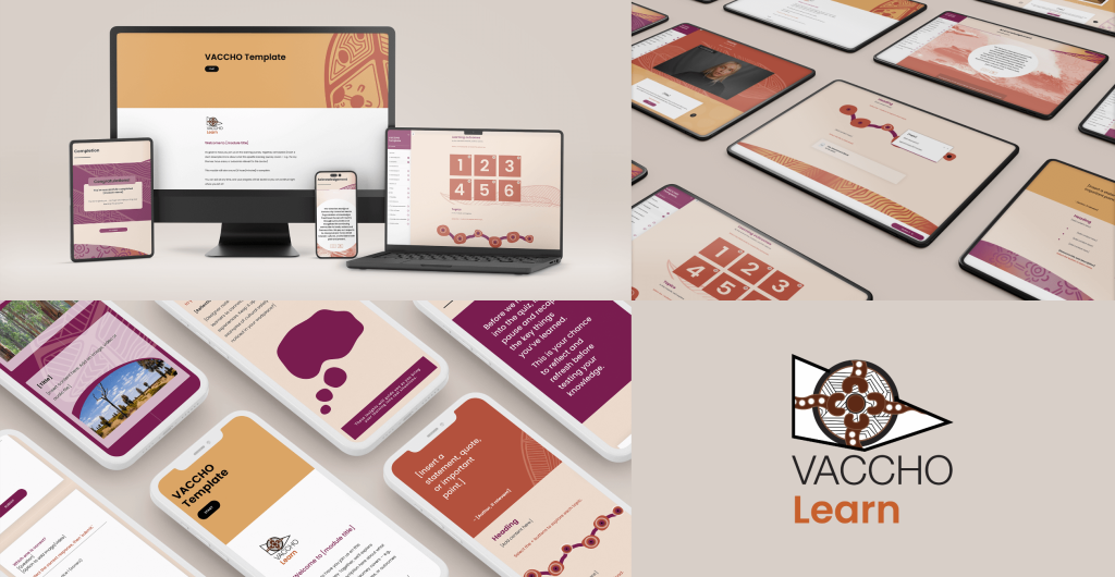
eLearning templates developed for the Victorian Aboriginal Community Controlled Health Organisation Inc. (VACCHO).
Final bite: Collaborate with purpose
We’re not saying “no more edits.” We’re saying make fewer, smarter ones. Co-design works best when it’s grounded in evidence, not endless iterations.
So when you’re deep in review mode, hit pause. Ask:
Does this change improve the learning experience?
Is it based on learner needs, or personal taste?
Are we solving a real problem, or just rearranging the furniture?
Good learning is bold, clear, and intentional. Trust the brief. Trust the learner. And trust that sometimes, less is more.
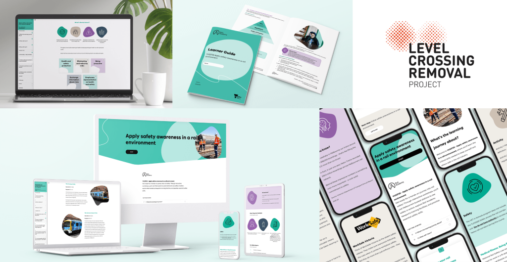
Built for the next generation of rail talent. A Certificate II in Rail Fundamentals, developed with the Level Crossing Removal Project (LXRP) for school-aged learners with future-focused goals.