
Quick answer
Design styles for learning are recognisable visual approaches, such as flat design, Swiss style or comics. They’re applied to courses, workshop kits and job aids. The right style helps learners find, read and remember what matters. Choose it for the learner and the job, keep one main style per program, and check every style for contrast and readability.
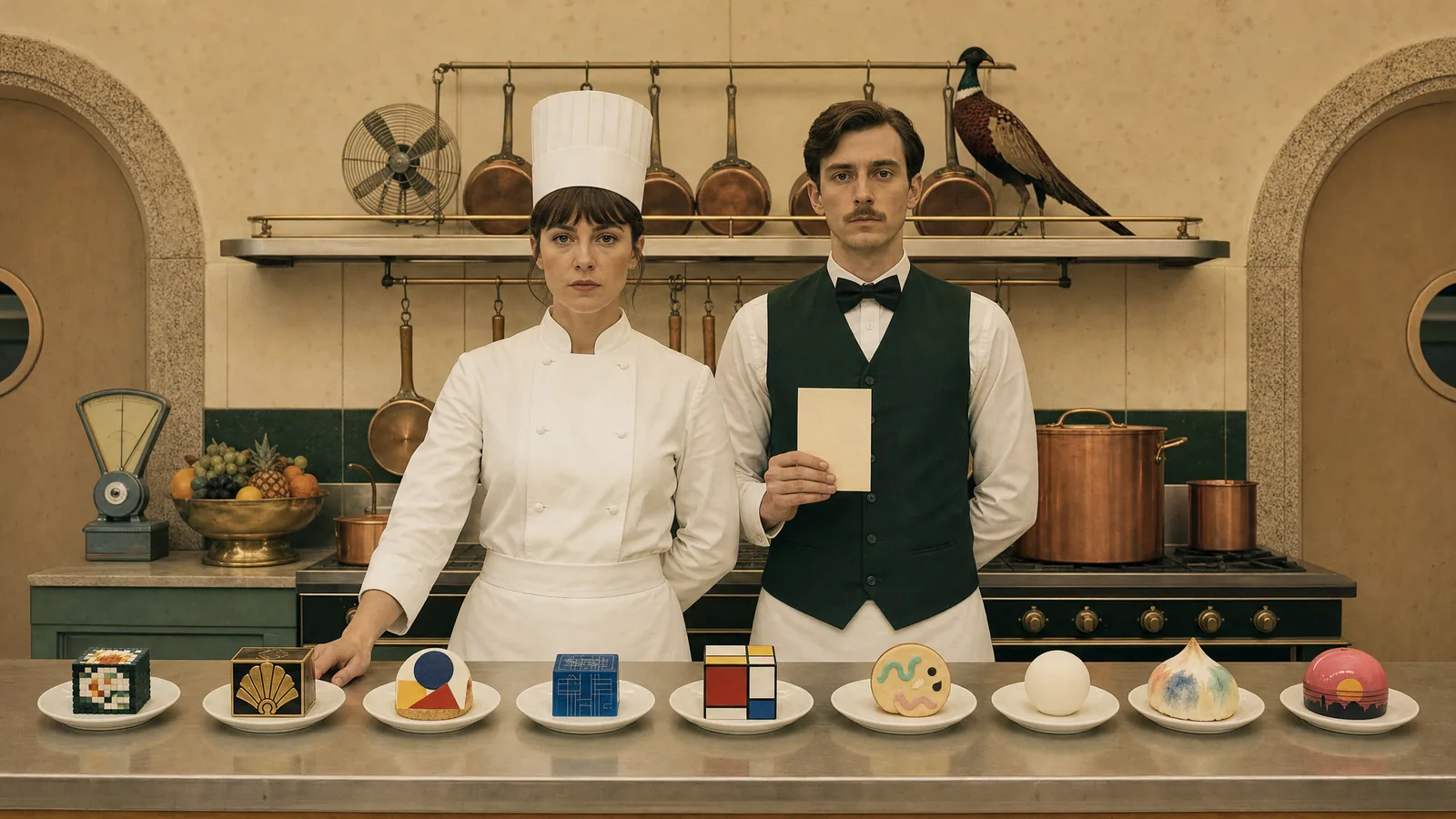
Learners judge your course before they read a word of it. If the look puts them off, even excellent content goes unread. This guide is a tasting menu of 52 real design styles. Each one appears on three to five pieces from one course, so you see it travel from screen to page to wall.
Key takeaways
- Choose a style for the job the material does, then check it fits your brand.
- Keep one main style per program and borrow a second one for a single moment.
- Every style has to pass the same contrast, readability and motion checks.
- Record your choice in a style guide.
What is a design style in learning design?
A design style is a recognisable visual approach, applied consistently to colour, type, layout and imagery. Bauhaus, Isotype and pixel art are all design styles. Your brand guide tells you which colours and fonts to use, and the design style tells you how to put them together.
In learning, the style is a design decision with a job to do. A job aid on a factory floor needs to be read in five seconds. A reflective journal needs to invite people to slow down. The same brand can wear both.
Why does design style change how people learn?
The style decides whether people start, and whether they can follow what you show them. In a 2006 study, Gitte Lindgaard and colleagues found people judged a web page’s visual appeal after seeing it for just 50 milliseconds. Those snap judgements closely matched the ratings people gave after ten times as long. In a Stanford study published in 2003, 2,684 people compared the credibility of real websites. The design look came up in 46.1% of their comments, more than any other factor. The study tested web pages, and a course home screen is a web page too.
Style can also get in the way. Richard Mayer’s research on multimedia learning found that people learn better when material that doesn’t serve the learning is left out. He calls this the coherence principle. A style helps when it makes the important thing easier to find, read and remember.
How do the six style families compare?
The 52 styles below fall into six families, and each family suits a different kind of learning job.
| Family | What it does for learners | Best on | Watch for |
|---|---|---|---|
| Clear and structured | Makes information quick to find and use | Policies, procedures, dashboards, job aids | Can feel cold without people in it |
| Characters and story | Gives learners someone to follow and remember | Scenarios, onboarding, behaviour change | Characters that feel generic or childish |
| Hands-on and print | Makes face-to-face sessions feel human | Workshops, flipcharts, workbooks, cards | Hard to repeat at scale |
| Photo and video | Shows the real world, or the mood of a moment | Safety, ethics, launches, explainers | Consent, and photos that hide detail |
| Famous eras | Borrows the energy of a known period | Campaigns, events, certificates | Pastiche that dates fast |
| Screen trends | Makes a course feel current | Apps, software training, tech audiences | Low contrast and motion |
Which design style suits which learning job?
Every picture below shows one course across several pieces, so browse the families that match your work.
Which styles make information easy to use?
These styles put structure first. They suit material people use under time pressure, and they’re the safest base for a long program.
Swiss style.
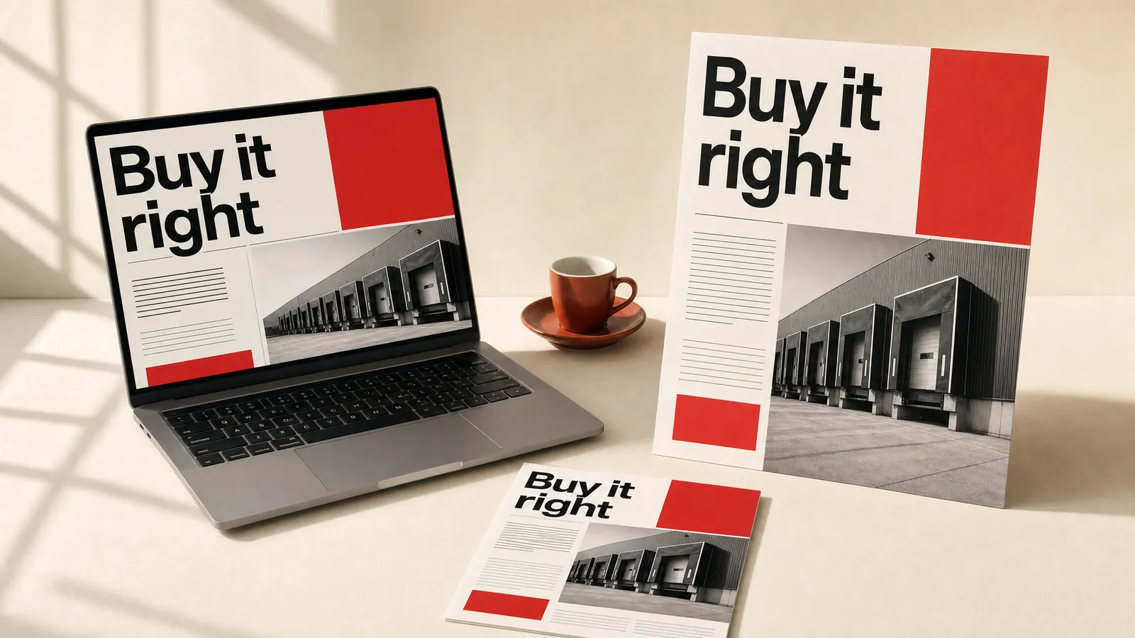
Formed in 1950s Switzerland, Swiss style lines everything up on a strict grid, with big sans-serif type and one accent colour. It makes policy, procurement and governance material look clear and trustworthy. Build the grid first, because the whole style depends on it.
Minimalism.
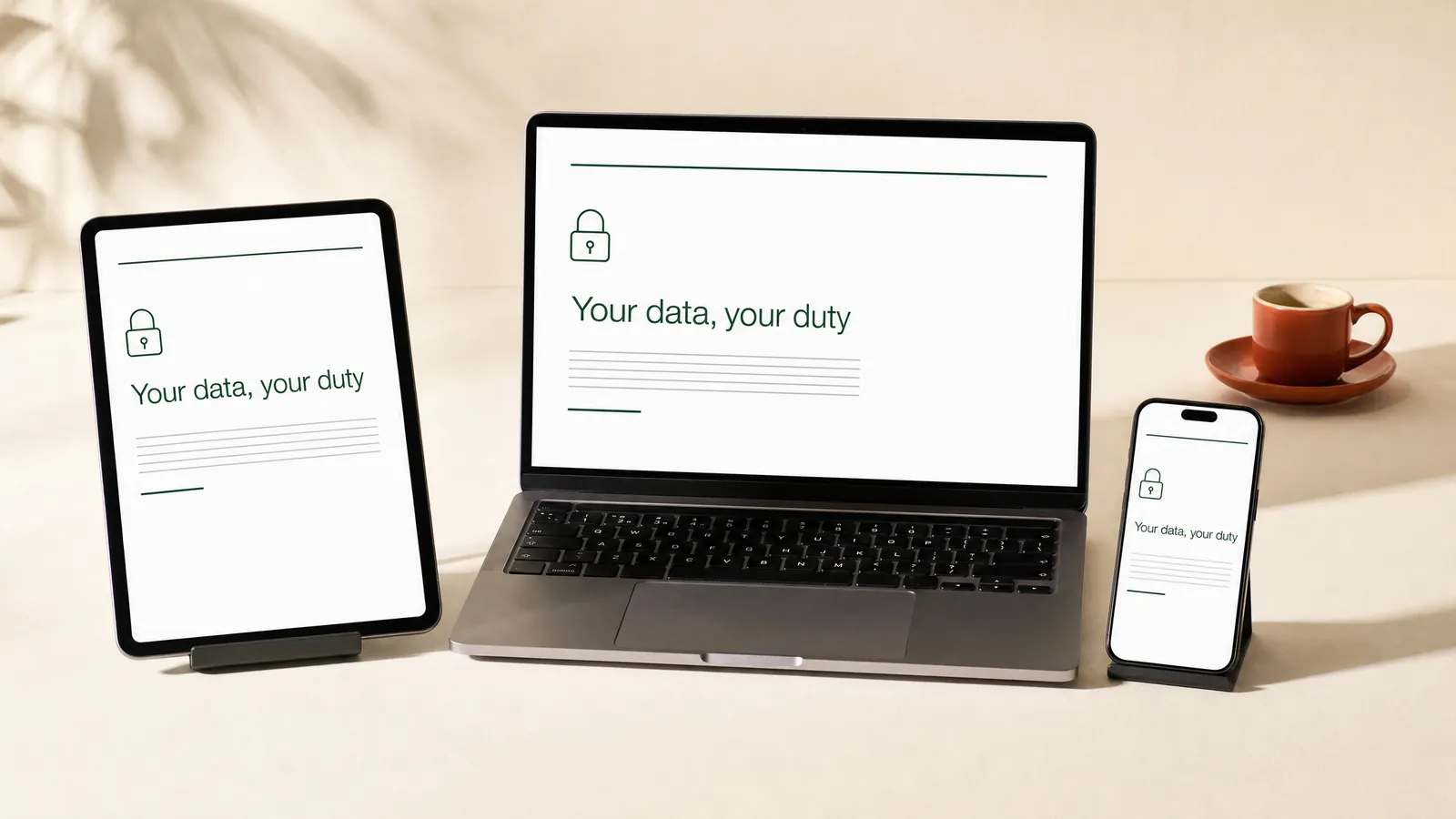
Minimalism strips everything back to white space, one typeface and one accent colour. It suits short compliance topics people fit in between tasks. Keep every label and instruction people need.
Flat design.
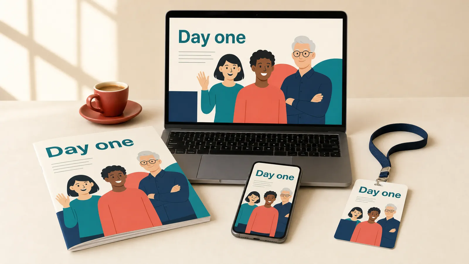
Microsoft’s Metro design (2010) and Apple’s iOS 7 (2013) made flat design mainstream. It uses solid colours and simple shapes with no shadows or textures. It’s quick to build and easy to keep consistent, and a small cast of flat characters can appear on every piece. Make sure every button still looks like a button.
Material Design.
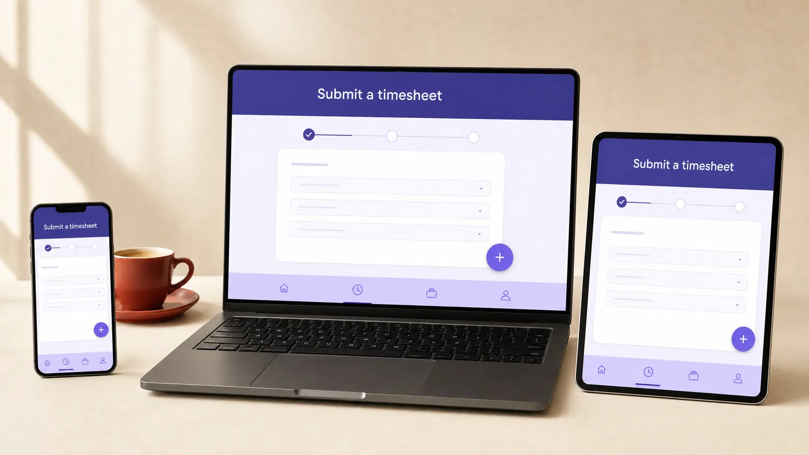
Google released Material Design in 2014, with rounded cards, clear layers and consistent controls. It suits software simulations, because learners already know how its buttons behave. When people will use a different system at work, mirror that system instead.
Bento grid.
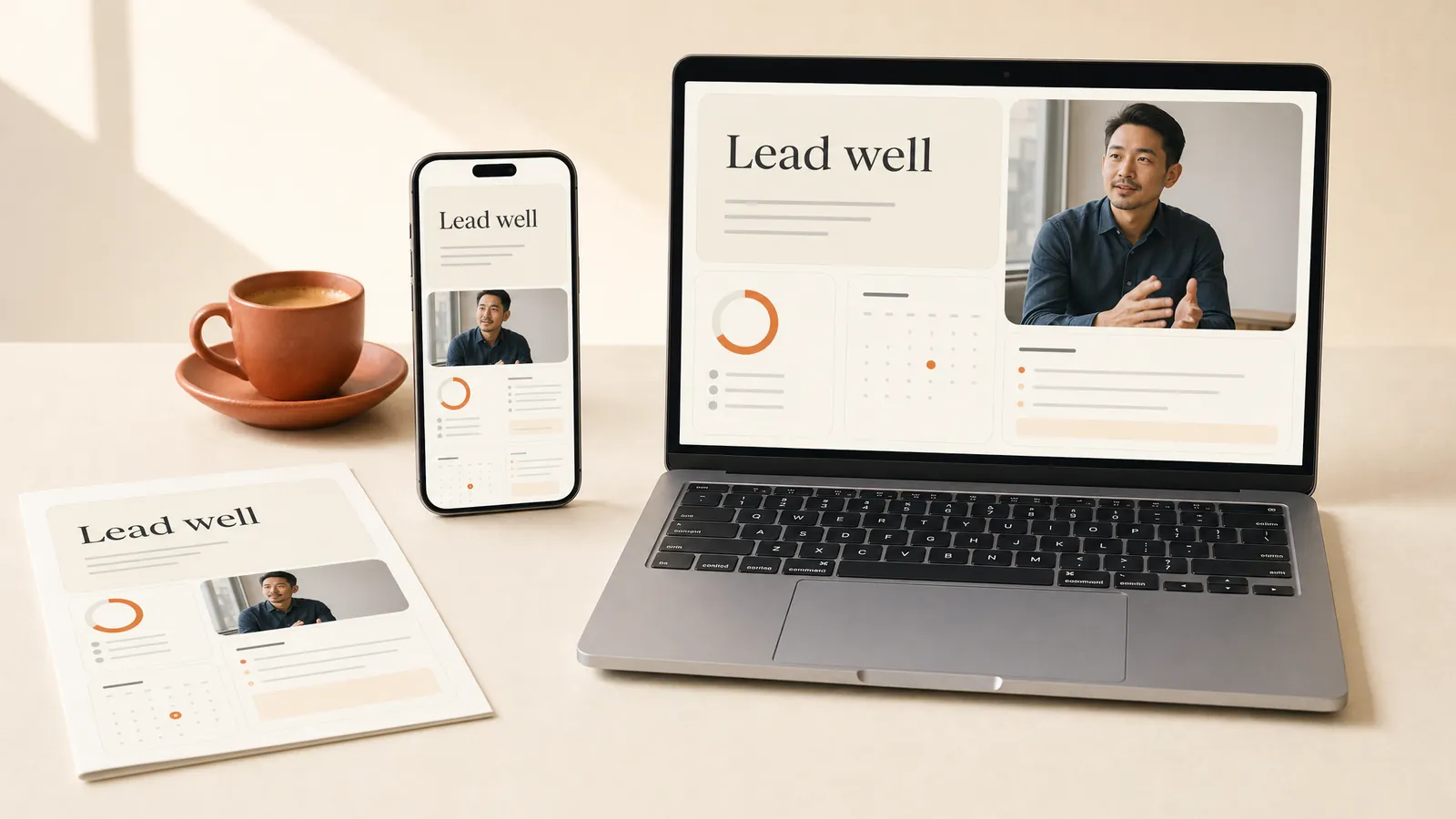
Named after the Japanese lunch box, a bento grid arranges content in rounded tiles of different sizes. It turns a program home page into a dashboard learners take in at a glance. Give the biggest tile to the next thing they should do.
Infographic design.
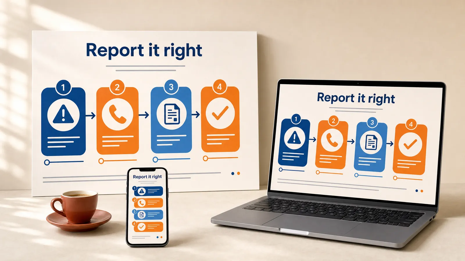
William Playfair published the first bar and line charts in 1786, and infographics have been turning processes into pictures ever since. They suit one-page guides that show a process people act on. Cut to the steps learners need, because a poster of every fact helps nobody.
Isotype.
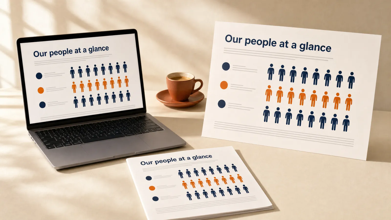
Otto Neurath developed Isotype in 1920s Vienna, first as the Vienna Method, to teach with rows of repeated pictograms. Each symbol stands for a set amount. Learners see the proportion before they read the number. Use real data and say what one symbol stands for.
Isometric illustration.
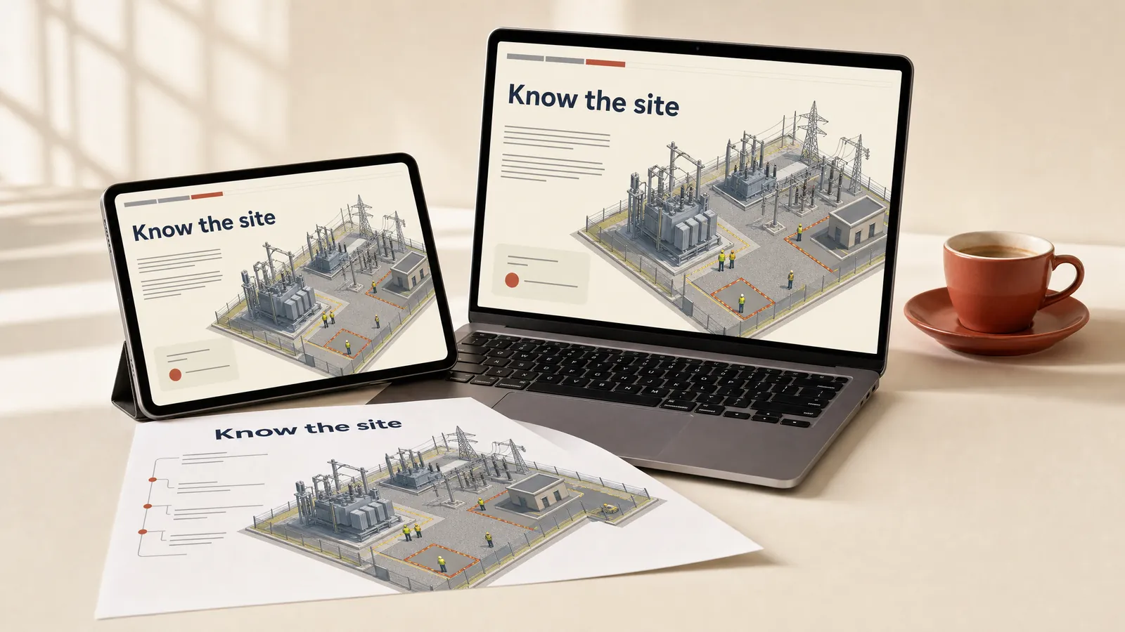
Isometric drawing shows a 3D scene at a fixed angle with no vanishing point, so a site looks like a tidy model. It suits site maps, inductions and process flows. Put the labels in a numbered legend, because small type disappears fast.
Editorial design.
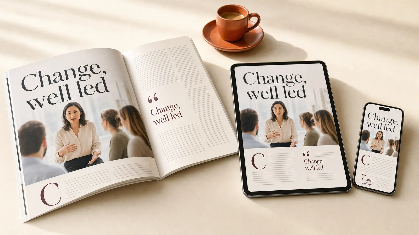
Borrowed from magazines, editorial design uses big serif headlines, pull quotes, drop caps and full-bleed photos. It makes leadership workbooks and program guides inviting to read. Plan a single-column version for phones.
Scandinavian design.
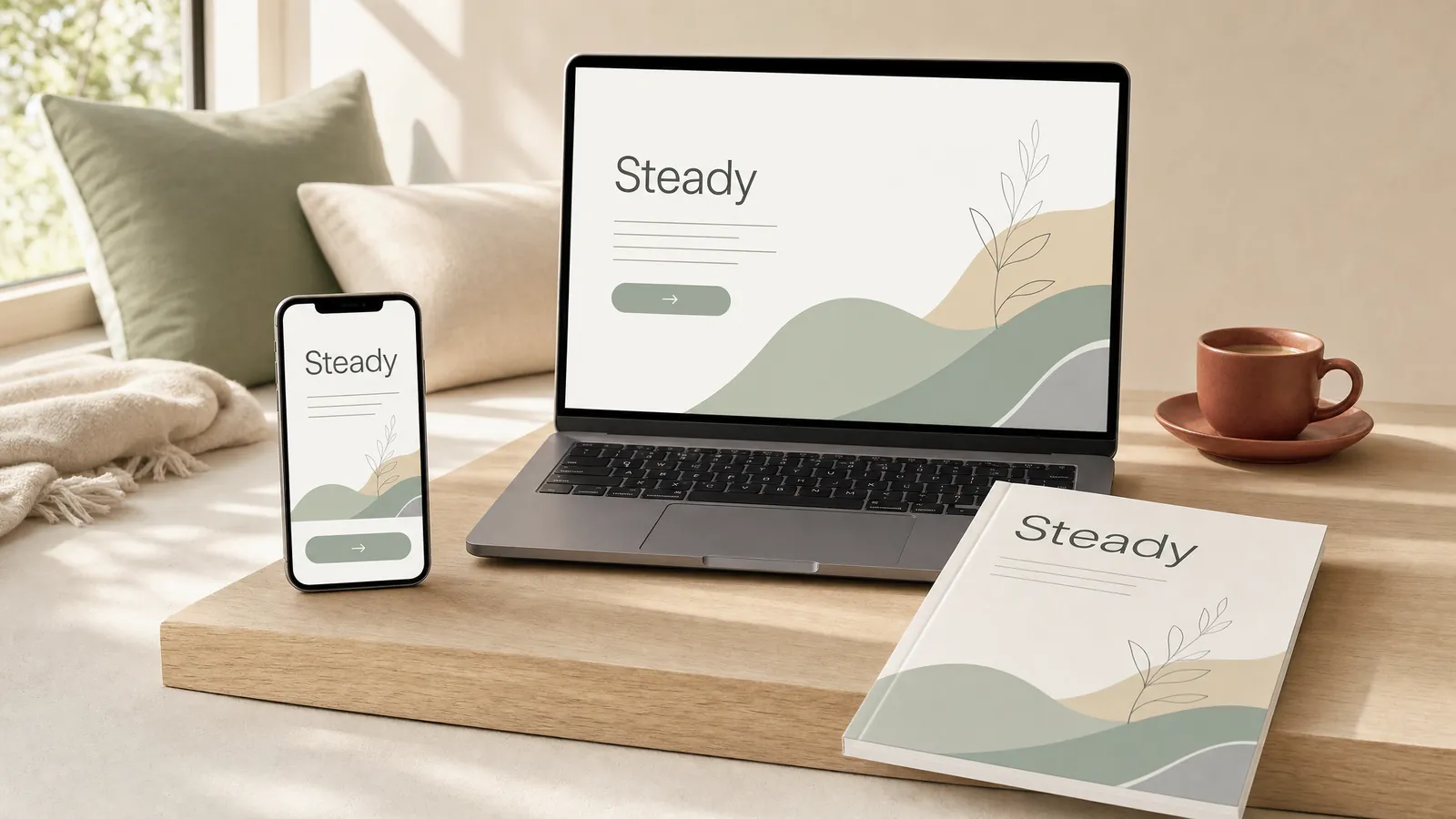
Scandinavian design flourished across the Nordic countries in the 1950s, with light timber, muted natural colours and functional shapes. It suits wellbeing and sustainability programs that should feel calm and honest. Muted palettes can lack contrast, so test the text.
Bauhaus.
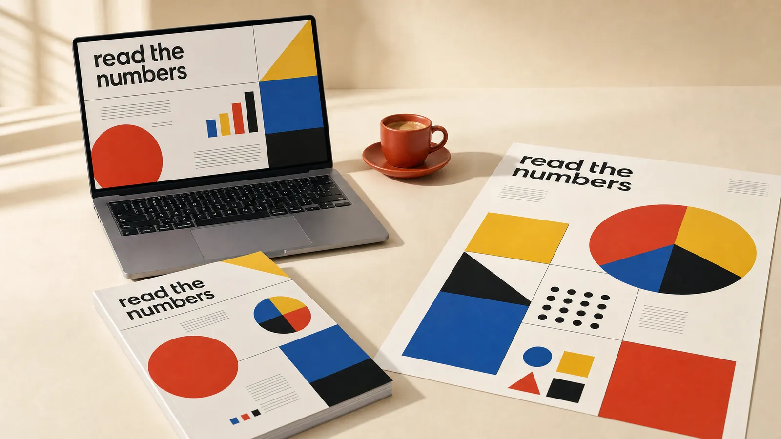
Walter Gropius founded the Bauhaus in Germany in 1919, and its circles, squares and triangles in primary colours still look modern. It suits courses that explain an idea with a few shapes, such as data or proportion. Let colour code one thing only.
De Stijl.
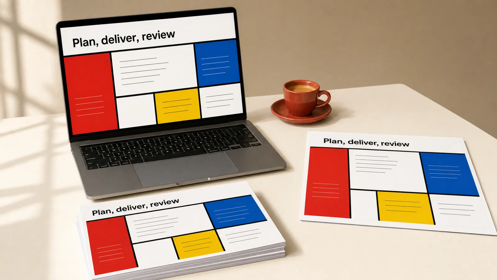
The Dutch De Stijl movement of 1917 used straight black lines, white space and blocks of red, yellow and blue. It suits a cycle or a set of stages, one block per stage. Keep the words in the white blocks, where they read best.
Which styles bring characters and stories to life?
A character gives learners someone to follow. Put a problem in front of a character and people start predicting what the character will do next, which is the thinking you want. In a 1997 study by James Lester and colleagues, 100 students used a botany program with an animated tutor. They rated the tutor as believable and helpful, even in a version that gave no advice, and the researchers called this the persona effect.
I described what I’ve seen in our own work in one of our resource hub interviews.
“We’ve had quite a few courses where we’ve used either 2D animation or a humanistic kind of blob, and those characters will represent certain inappropriate workplace activities that might be a bit challenging if it was a real person. So I think animation, when used in certain circumstances, can really help people focus on the underlying message without being distracted by the appearance or similarity to a situation they may have actually seen in the workplace.”
Michael Peart, Managing Partner, Hungry Minds
Our post on why we sometimes put characters in eLearning goes further.
Comics.
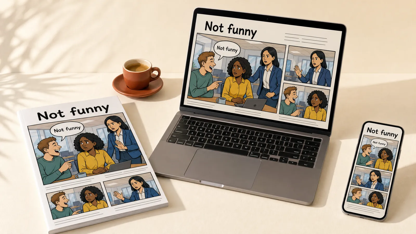
Comics tell a story in panels, usually with speech bubbles, bold inks and flat colour. Europe traces the form to Rodolphe Töpffer’s picture stories, the first drawn in 1827. They suit respect, conduct and customer scenarios where learners follow a character through a mistake and a fix. Write the dialogue first, then size the panels.
Picture book illustration.
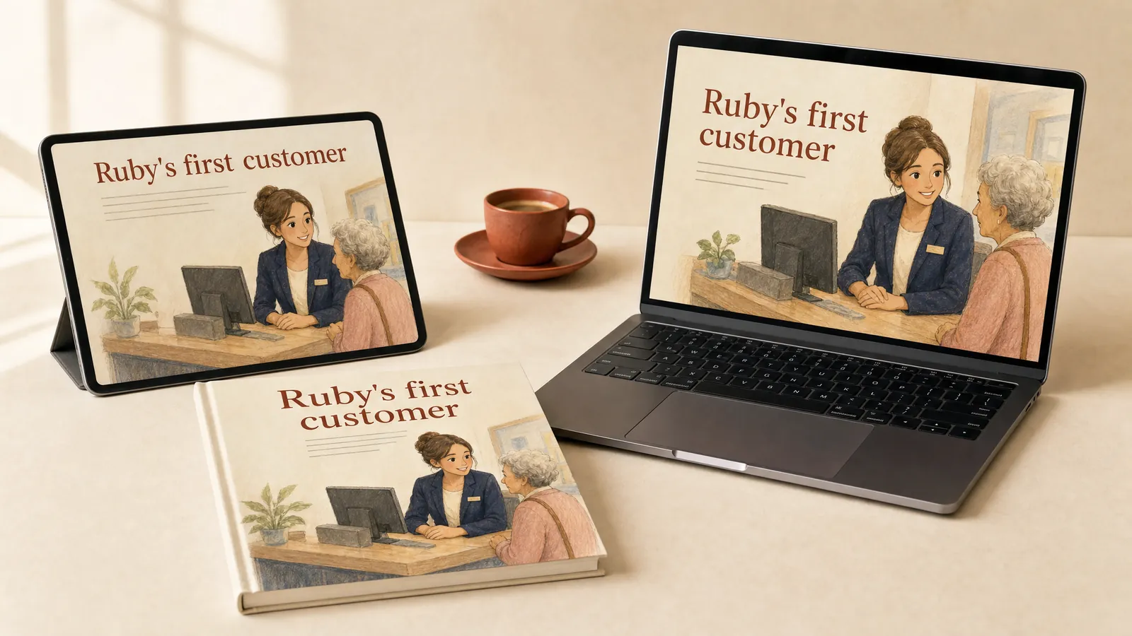
Picture book illustration uses warm, hand-painted scenes with a few lines of story on each page. It turns a customer service lesson into a short story adults remember. Keep the characters and problems grown up, so it feels warm and never childish.
Clay animation.
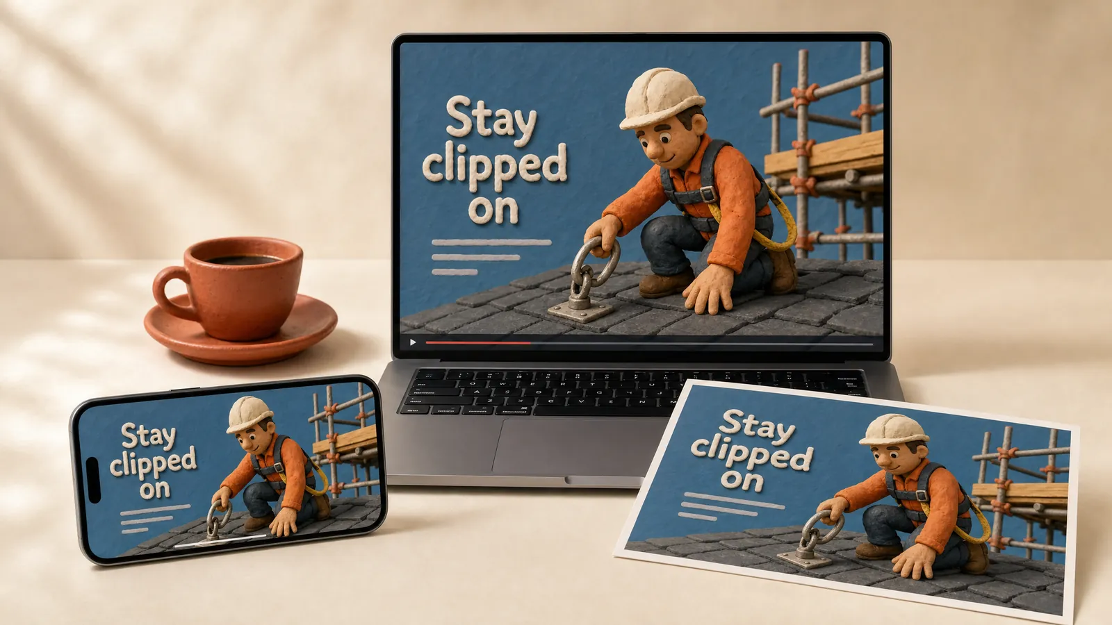
Clay animation moves handmade clay figures a frame at a time, and Aardman’s Wallace and Gromit are the best-known example. It lets you show a dangerous moment safely and gently. Real stop-motion takes weeks, so ask whether a digital clay look will do.
Corporate Memphis.
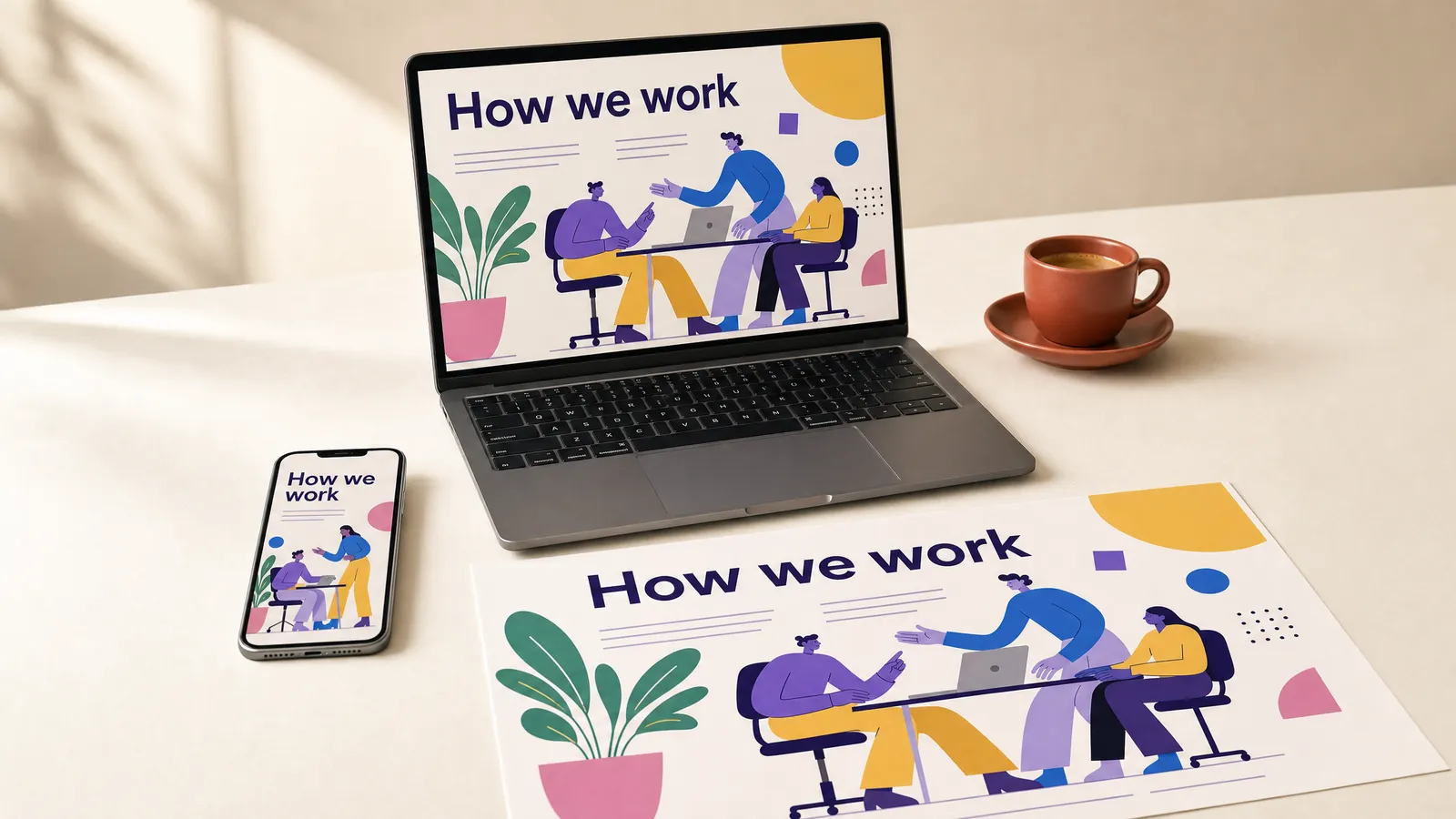
The agency Buck designed the Alegria illustration system for Facebook in 2017, and critics later named the look Corporate Memphis. It shows flat people with long limbs, small heads and skin in colours like purple and blue. It fills an onboarding course with friendly people quickly. Critics find it bland, so give your characters real jobs and real settings.
Watercolour illustration.
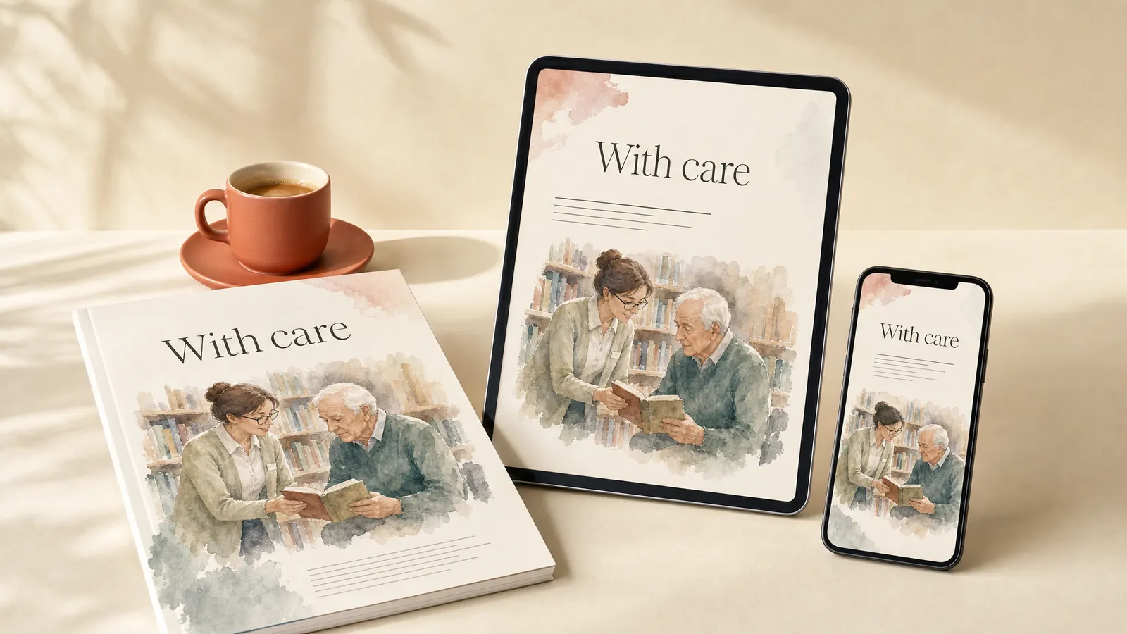
Watercolour uses soft, layered washes with loose edges and visible paper. It suits care and wellbeing programs that need to feel gentle. Keep text on white, because pale washes behind words lower the contrast.
Mid-century modern.
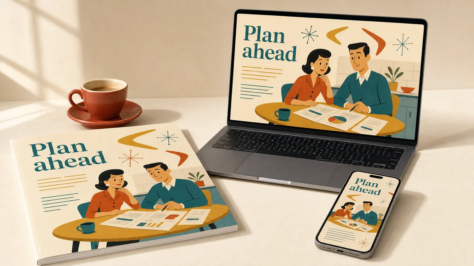
Mid-century modern graphics, popular from about 1945 to 1970, pair simple stylised people with boomerang and starburst shapes. They make money and life-stage topics feel friendly. Pair them with plain modern type so the retro look doesn’t date the content.
Pixel art.
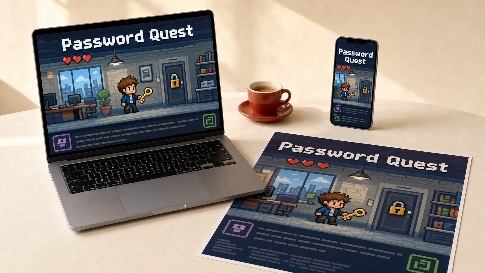
Pixel art draws everything in visible square pixels, the look of arcade games like Space Invaders. It turns a quiz into a game with lives and levels. Use pixel fonts for titles only, because long passages are hard to read.
Low poly.
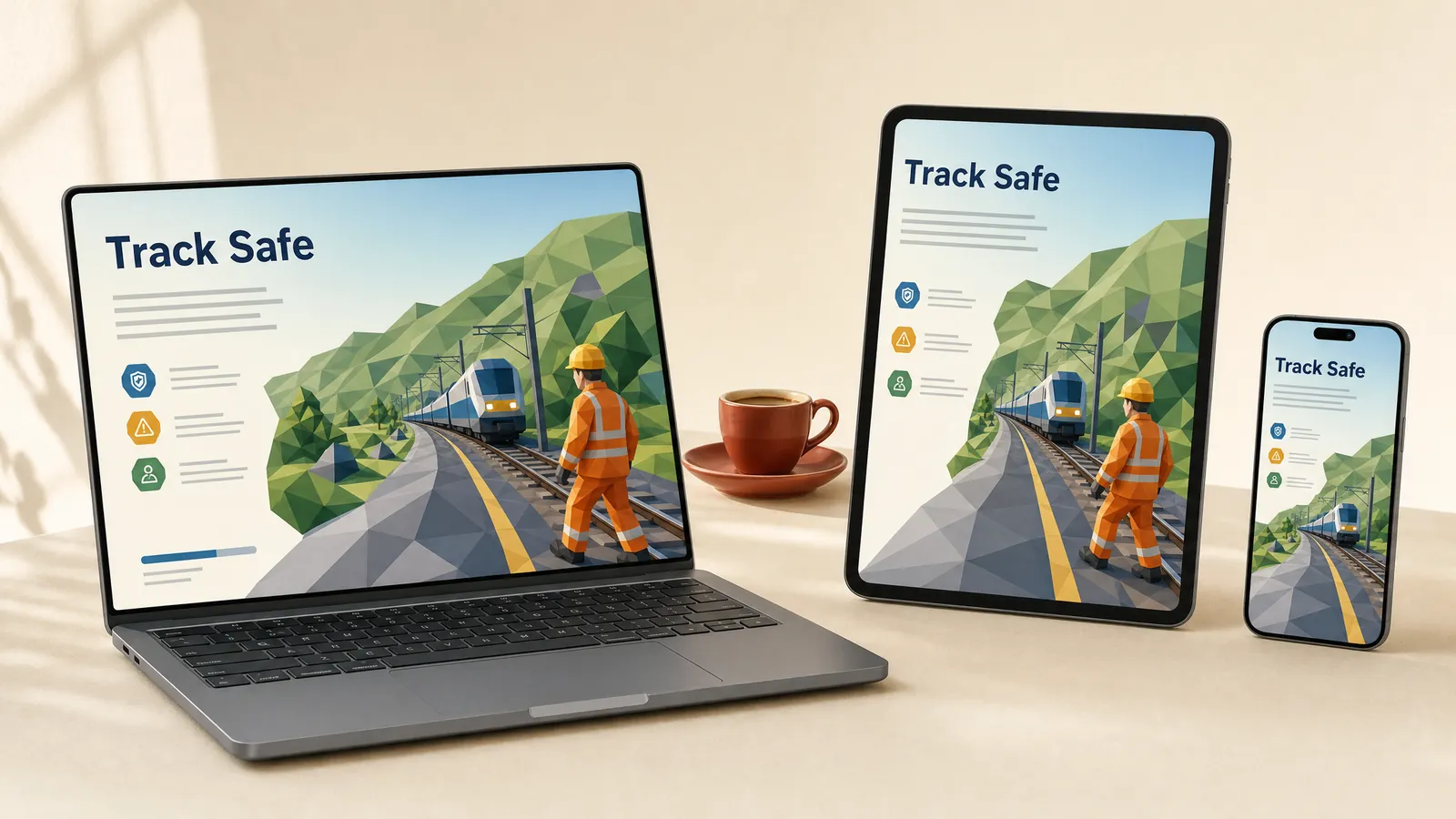
Low poly builds 3D scenes from a few flat-shaded triangles, a look that began as a limit of 1990s games consoles. It suits site and vehicle scenarios where a simple model makes the decision real. Check the hazard you’re teaching still reads at that level of detail.
Which styles make face-to-face learning feel hands-on?
These styles carry the marks of a hand or a press. They make workshops and printed kits feel personal, and they’re harder to repeat across a hundred screens.
Sketchnoting.
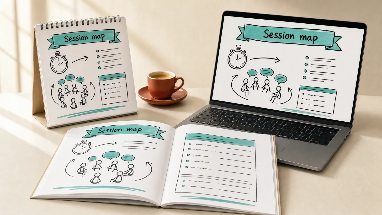
Mike Rohde coined the word sketchnote in 2006 for visual notes of hand-drawn words, boxes, arrows and simple icons. It suits session plans, summaries and facilitator guides. Scan and tidy the drawing before you print it.
Hand lettering.
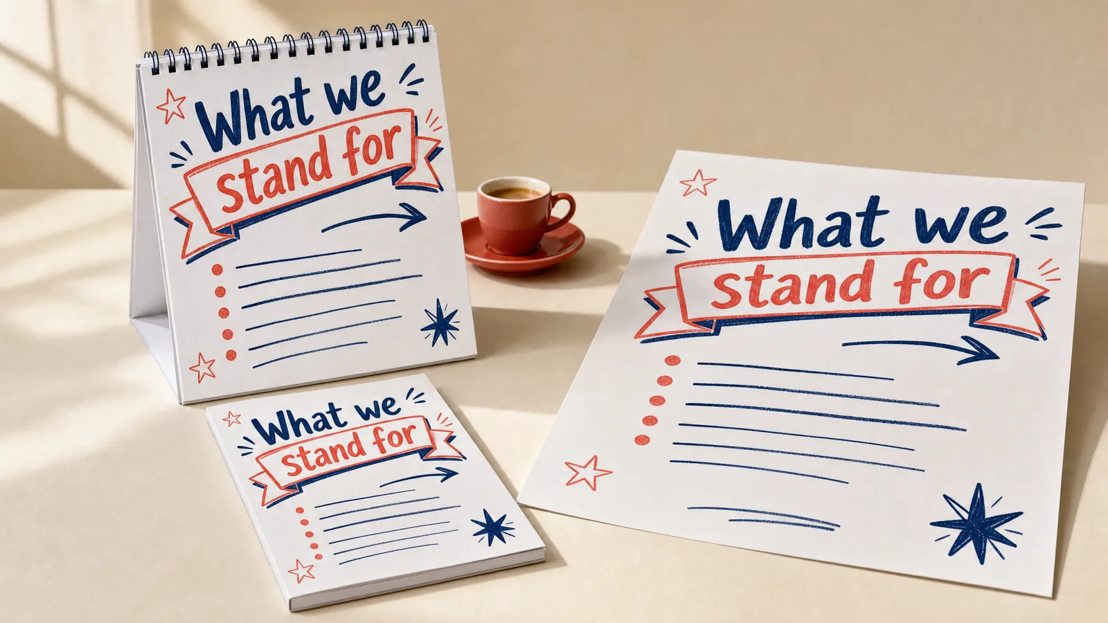
Hand lettering draws each word instead of typing it, the craft of the signwriter. It makes a workshop flipchart or values wall feel made for the room. Two marker colours and big letters read better from the back of the room than elaborate scripts.
Letterpress.
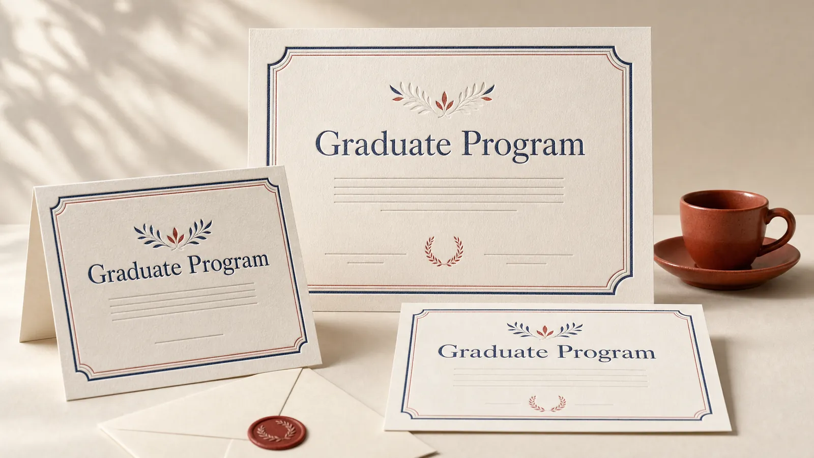
Letterpress presses type into thick paper, a technique that goes back to Johannes Gutenberg’s movable type around 1440. It suits the pieces people keep, such as certificates and invitations. True letterpress costs more, so a digital press look can carry the rest of the kit.
Woodcut and linocut.
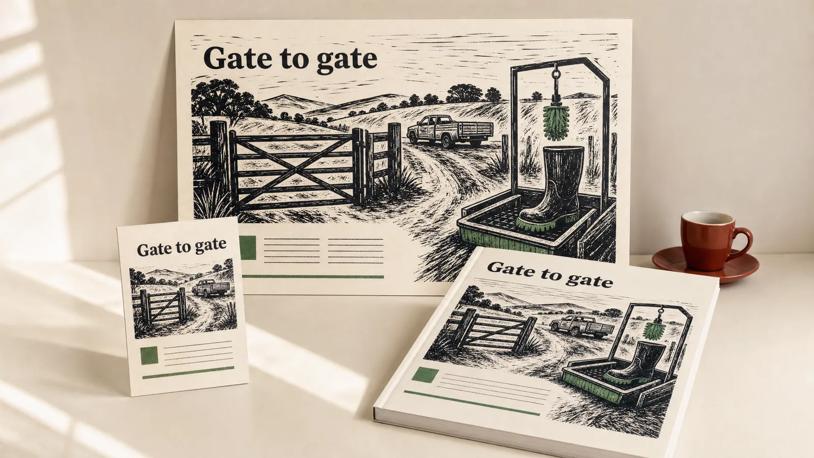
Woodcut and linocut prints show every carved line and gouge mark, usually in black and one accent colour. They suit job aids and field guides for farming and outdoor work. Keep the illustrations bold, so they still read on a photocopy.
Risograph.
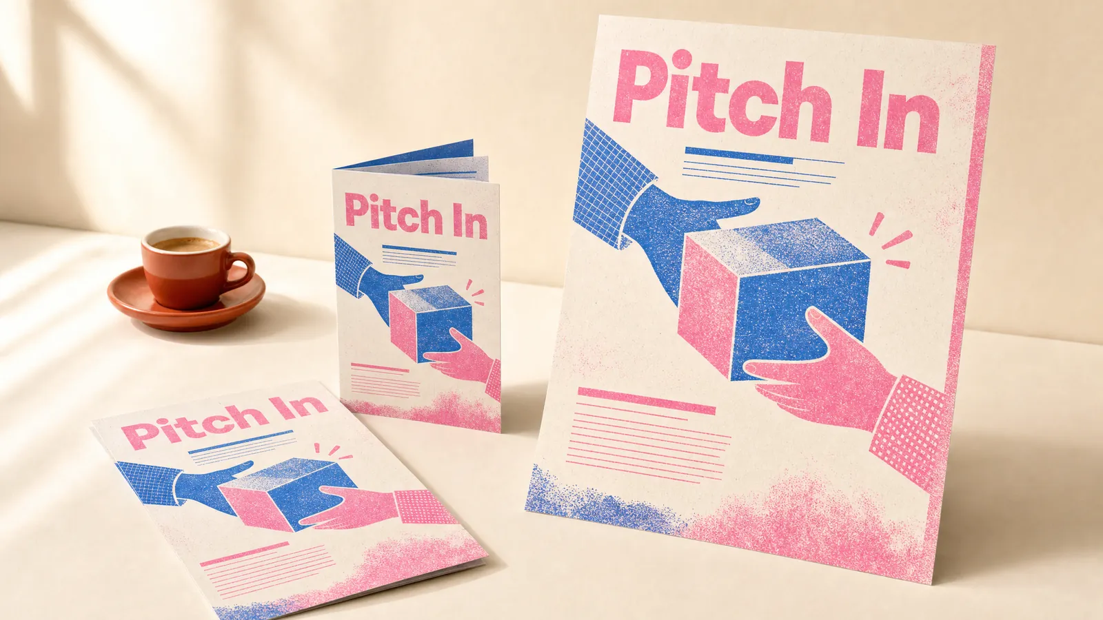
Riso Kagaku introduced the Risograph printer in Japan in 1980, and its bright spot colours and grain became an art look. It suits handouts for community and volunteer programs. Supply a plain version too, because fluoro inks copy badly.
Zine.
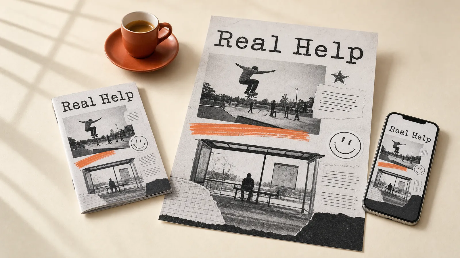
Zines are small self-published booklets made with scissors, glue and a photocopier, a punk staple since the 1970s. They suit youth and peer programs, where a homemade feel builds trust. Check the facts as hard as you would in a policy.
Collage.
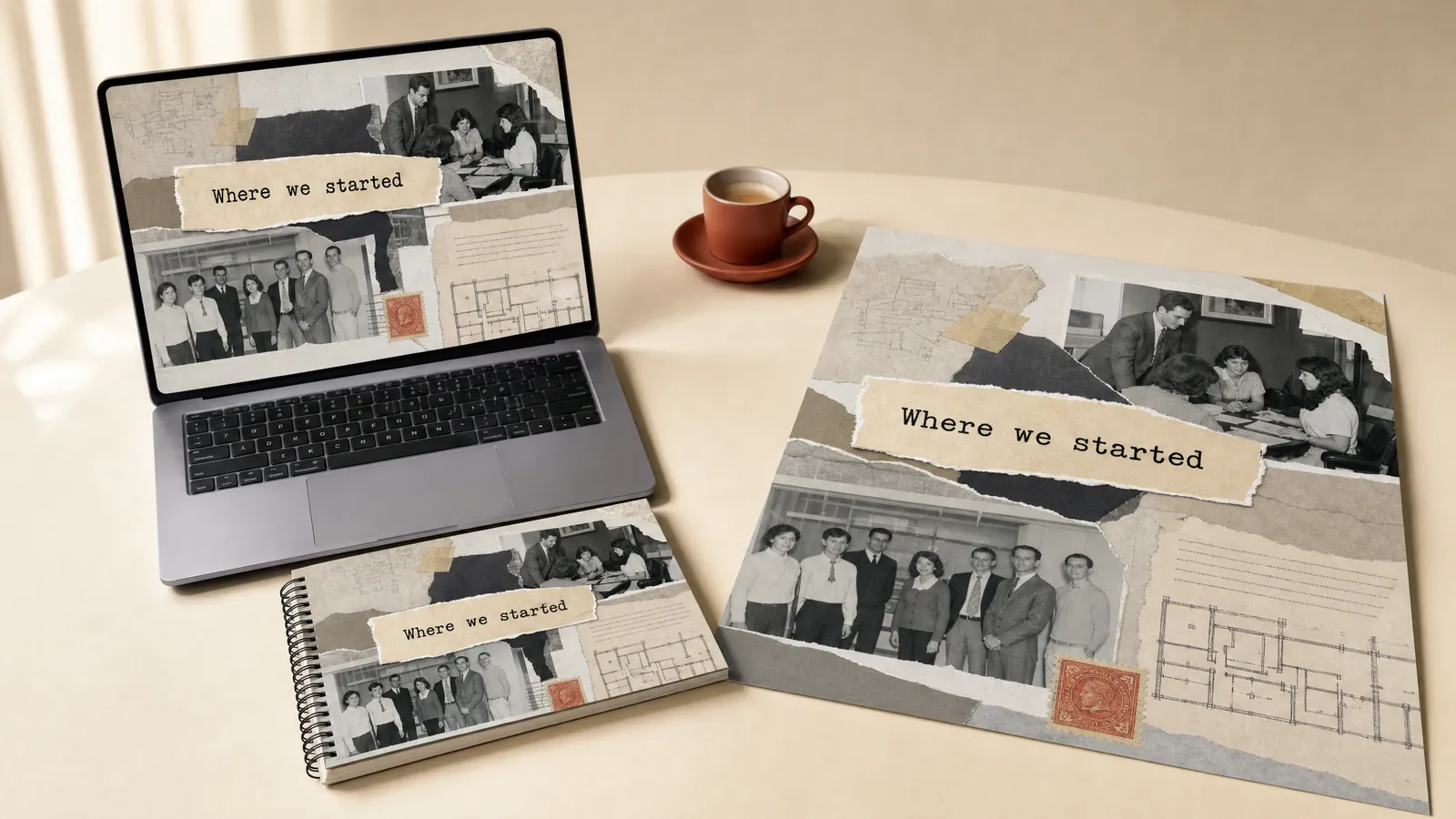
Collage builds a picture from cut and torn pieces, a technique Braque and Picasso brought into modern art. It suits induction and culture sessions that tell the organisation’s story with its own artefacts. Leave one clear space for the headline.
Scrapbooking.
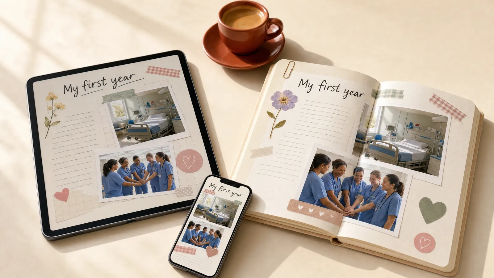
Scrapbooking pastes photos, tape, notes and keepsakes onto the page, a hobby with roots in 19th-century Britain. It suits reflective journals and portfolios, where learners collect evidence of their own growth. Print it with blank pages and a pocket for keepsakes.
Blueprint.
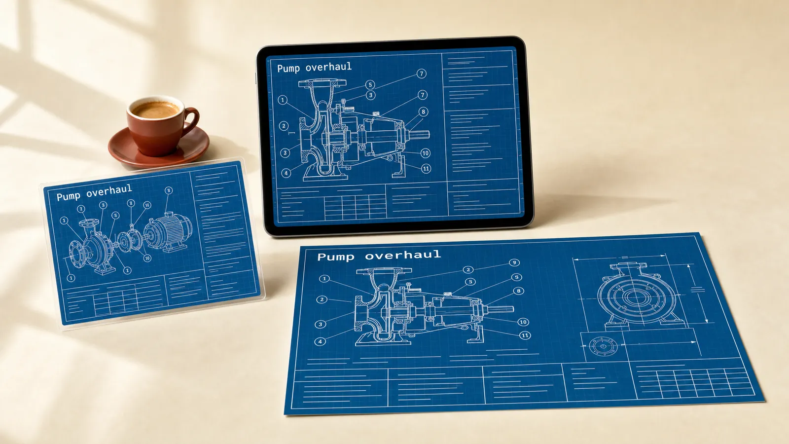
John Herschel introduced the blueprint process in 1842, and its white lines on deep blue still say engineering. It suits maintenance job aids and equipment training. Check every callout reads at arm’s length.
Which styles shape photos and video?
These styles are about how you shoot, light and move the image. They do the most when the real world, or the mood of a moment, is the point.
Documentary photography.
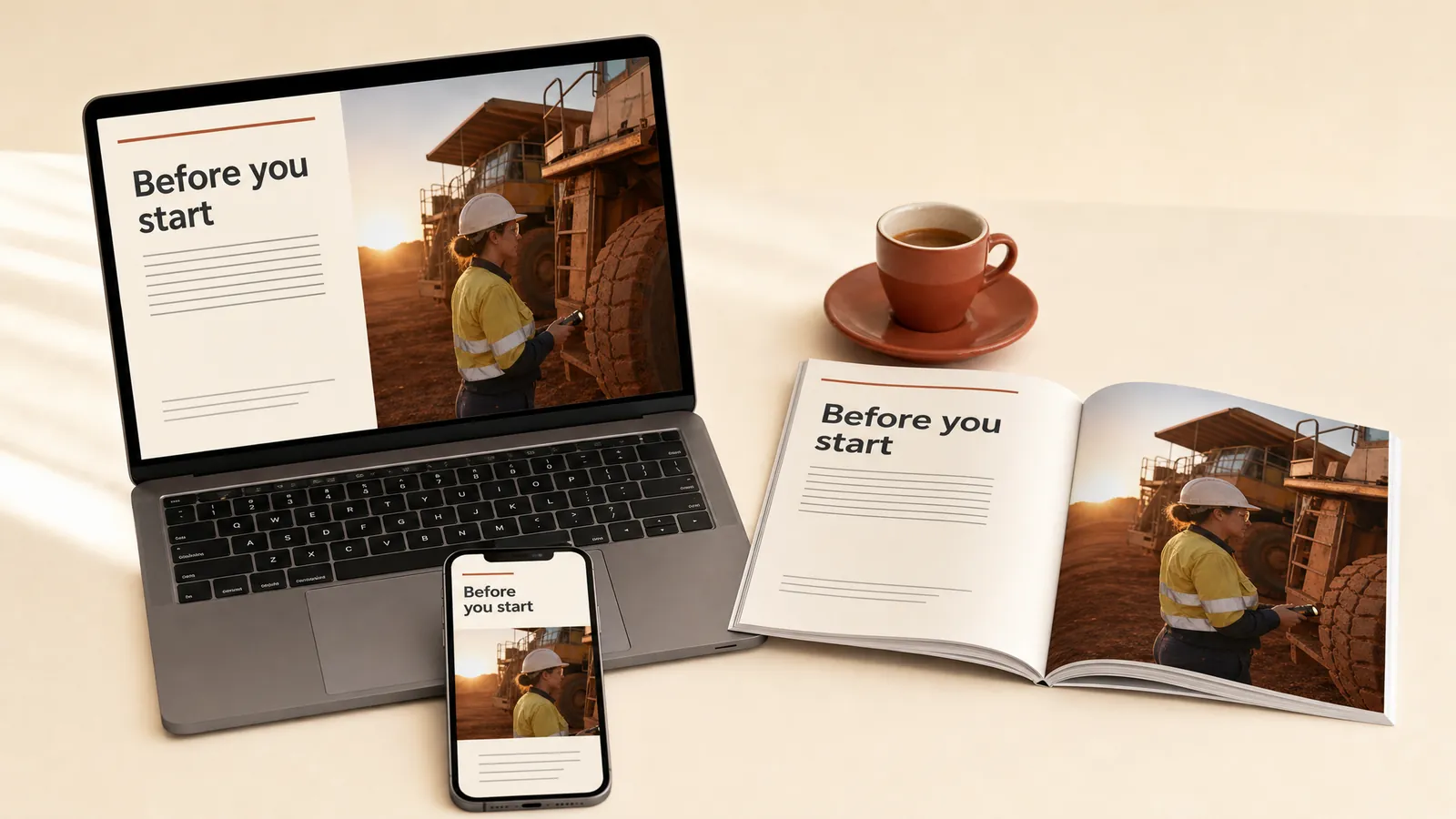
Documentary photography shows real people in real settings, unposed, a tradition that goes back to Jacob Riis’s photographs of 1890s New York. It suits safety and procedure training, where learners need to recognise their own site. Get consent, and make sure every photo shows the current safety gear.
Chiaroscuro.
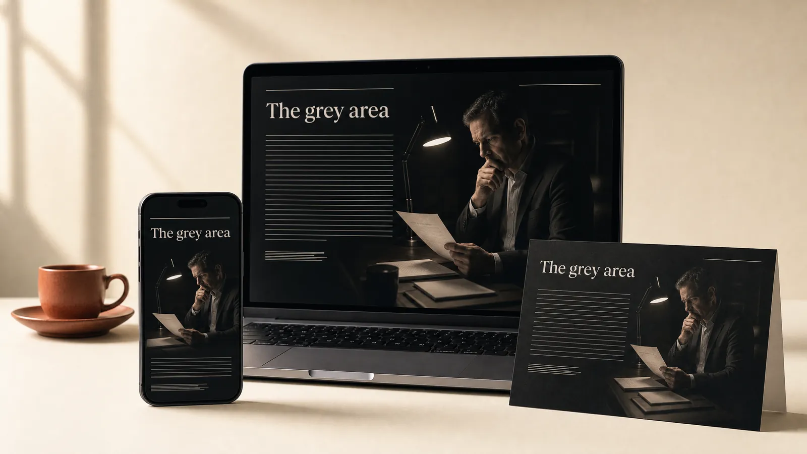
Chiaroscuro, Italian for light-dark, uses one strong light and deep shadows, the lighting of Caravaggio and of film noir. It suits ethics scenarios, where the mood tells learners a decision matters. Put text and buttons on a plain panel, away from the shadows.
Duotone.
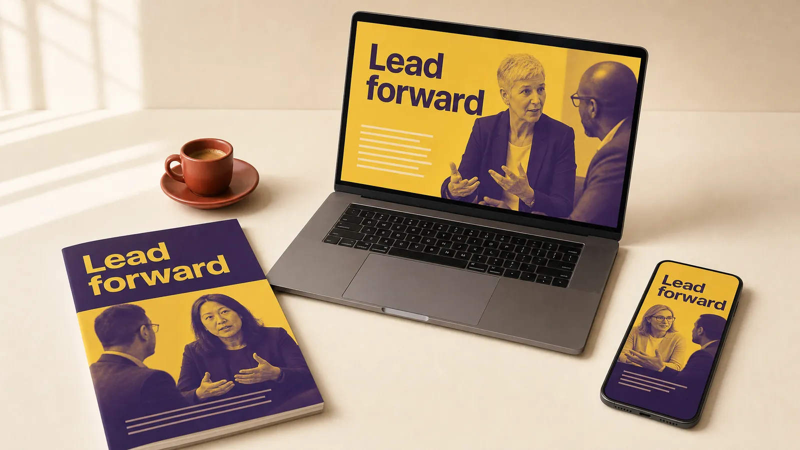
Duotone reduces a photo to two colours, a printing technique now built into Photoshop. It makes mismatched photos from different shoots look like a set. Check faces are still recognisable in strong colour pairs.
Kinetic typography.
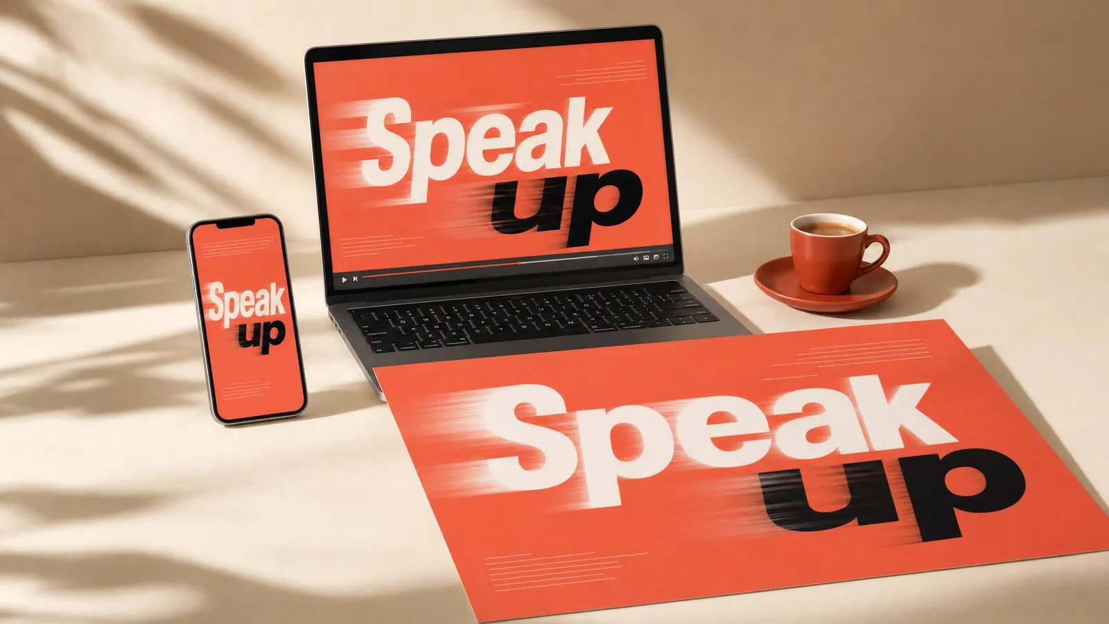
Kinetic typography makes words the moving image, an idea Saul Bass made famous with the opening titles of North by Northwest in 1959. It suits launch videos built around a few phrases. Hold each phrase long enough to read twice.
Whiteboard animation.
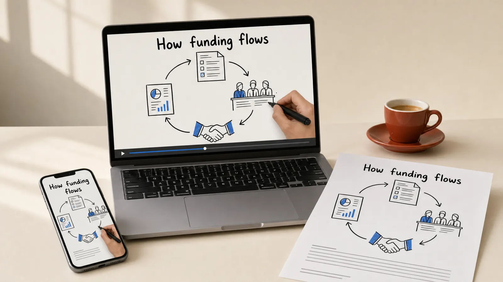
Whiteboard animation shows a hand drawing simple marker sketches while a voice explains, a format that took off on YouTube from 2009. It suits explainers for processes and cycles. Script the voice first, then time the drawing to it.
Which styles borrow a famous era?
Era styles bring instant energy and a story people recognise. They shine on campaigns, events and keepsakes, and they date faster than anything else here.
Art Deco.
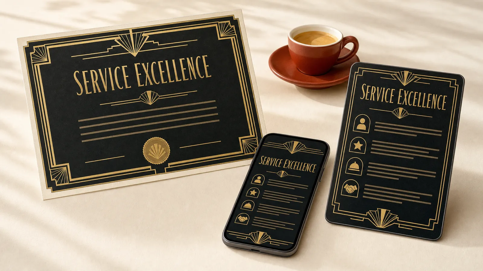
Art Deco took its name from the 1925 Paris exhibition of decorative arts: gold and black, sunbursts, fans and stepped frames. It suits certificates and service standards for hospitality and events. Keep small text plain, because gold on black can fail contrast.
Art Nouveau.
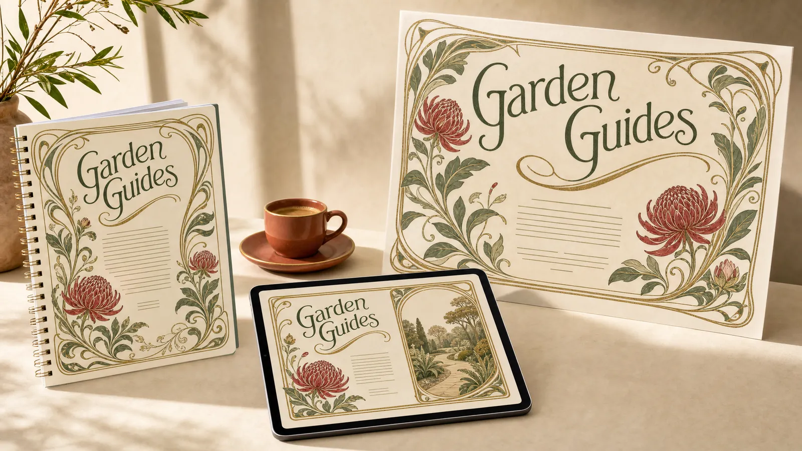
Art Nouveau, popular from about 1890 to 1910, is all flowing lines, flowers and ornate frames. It suits nature, heritage and wellbeing programs. Frame the cover and keep the inside pages open.
Pop art.
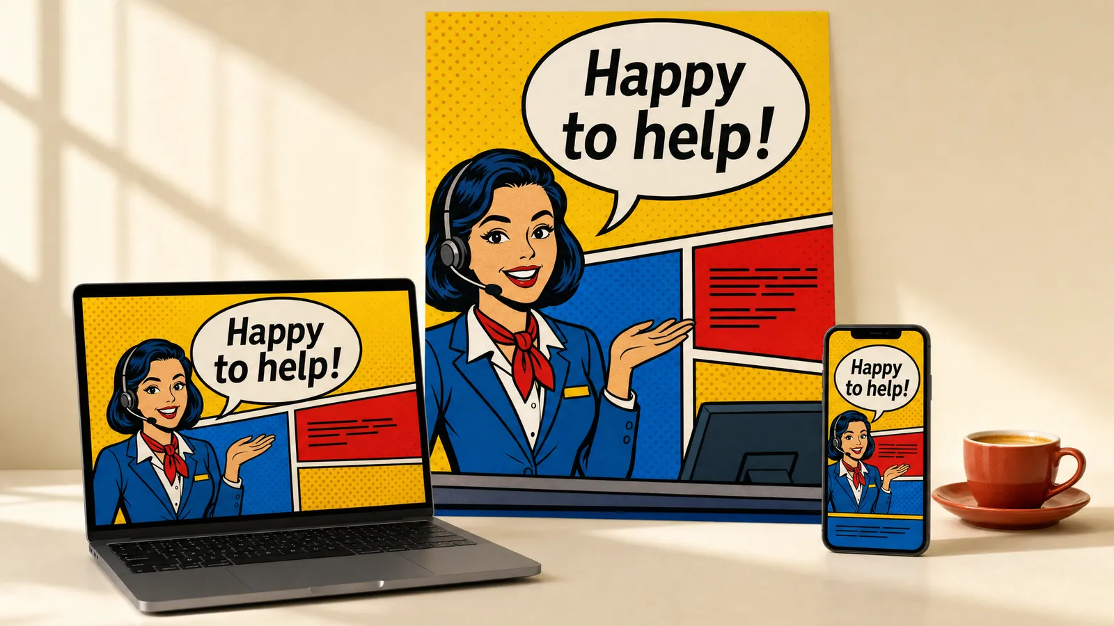
Pop art borrowed from comics and advertising in the 1950s: thick outlines, primary colours and halftone dots. It suits customer service campaigns, where one line needs to stick. Draw original characters rather than echoing famous artworks.
Psychedelic art.
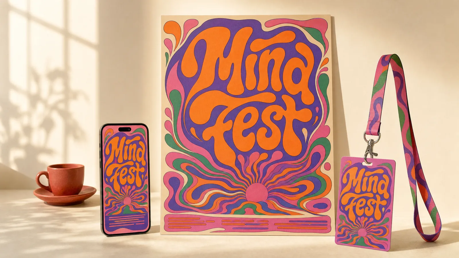
Psychedelic posters flourished in San Francisco from about 1966, with melting lettering and vibrating colour pairs. They suit event posters where mood beats information. Put the dates and details in plain type.
Constructivism.
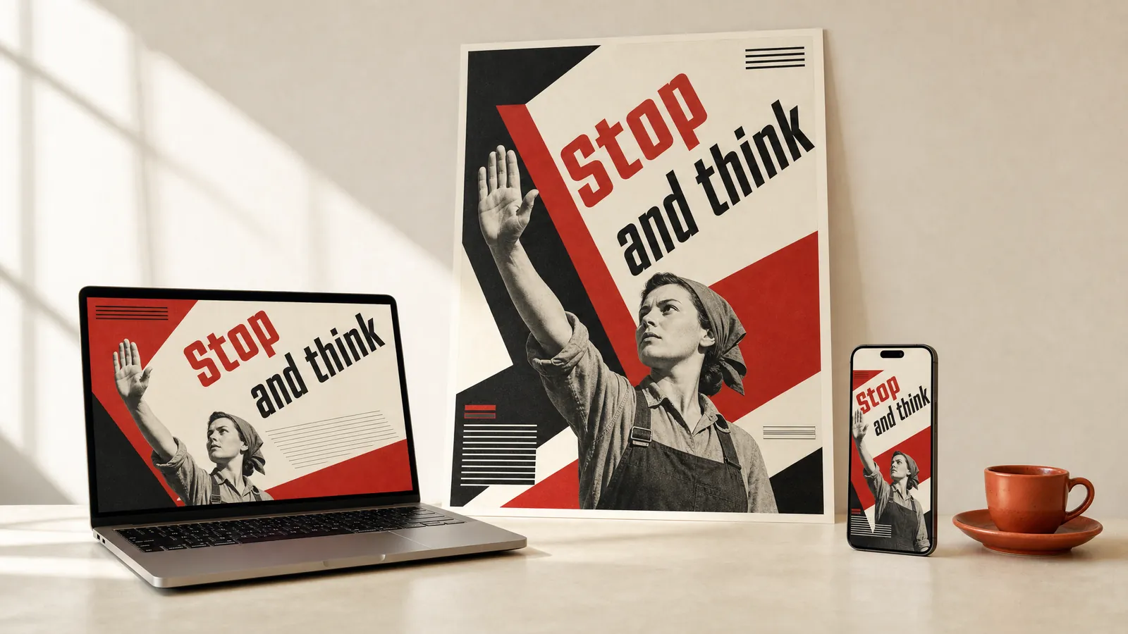
Constructivism began in Russia around 1915, with bold red, black and cream, strong diagonals and photomontage. It suits campaign posters that ask for one action. Keep the call to action short, because angled type is hard to read.
Memphis design.
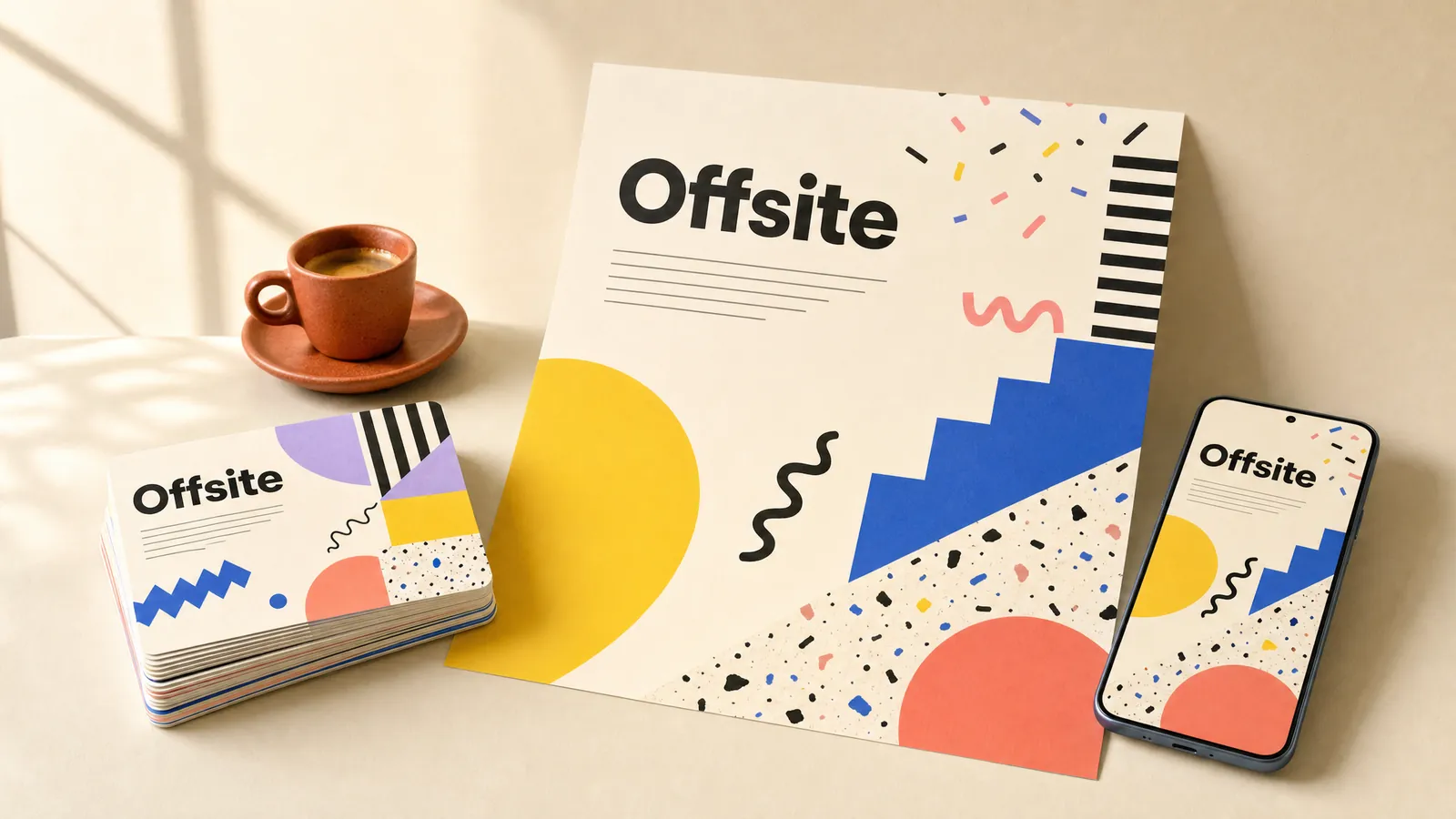
Ettore Sottsass founded the Memphis Group in 1980, and its squiggles, zigzags and clashing colours became the look of the decade. Corporate Memphis later borrowed its name. It suits team days and offsite kits that should feel fun. Keep patterns at the edges, away from the words.
Retrofuturism.
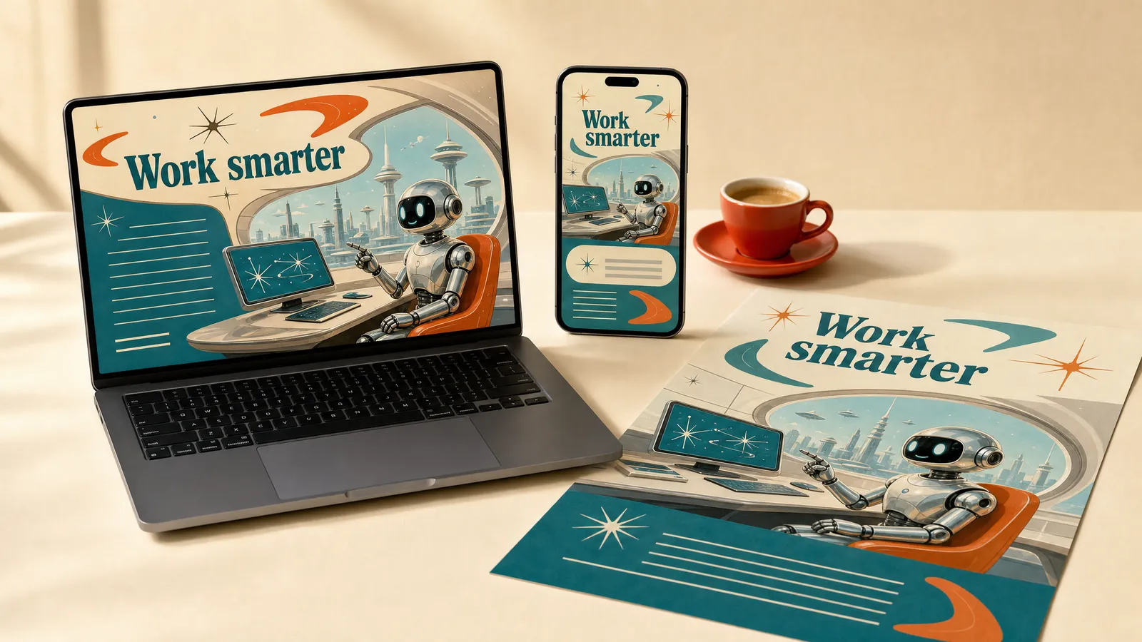
Retrofuturism shows the future as the 1950s imagined it, with rockets, robots and atomic starbursts. It suits technology and change programs told with a wink. Back the humour with clear how-to content.
Steampunk.
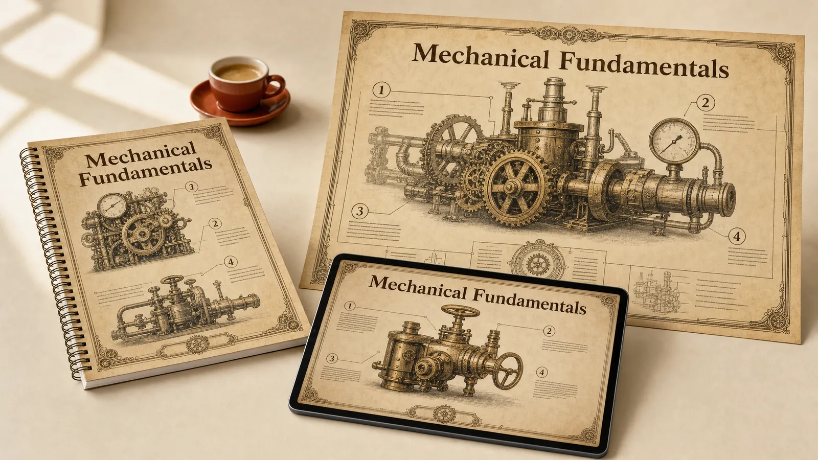
K. W. Jeter coined the word steampunk in 1987 for Victorian engineering pushed into fantasy: brass, copper, gauges and rivets. It suits apprentice and engineering workbooks. Keep the technical diagrams accurate under the ornament.
Grunge typography.
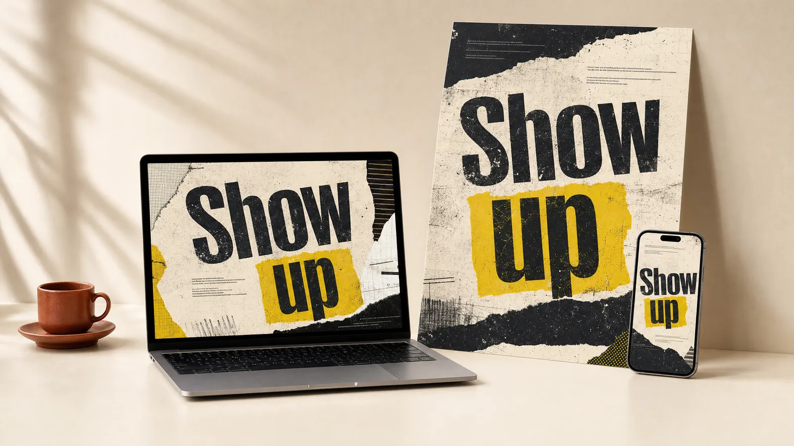
Grunge typography grew from the photocopied flyers of the early 1990s, with David Carson’s Ray Gun layouts the famous example. It suits section openers for youth and outreach programs that need to feel raw. Keep the teaching content clean and level.
Which screen styles need careful testing?
These styles make a course feel current, and several of them fail accessibility checks unless you adjust them. The Web Content Accessibility Guidelines (WCAG) set a contrast ratio of at least 4.5 to 1 for normal text. They also limit flashing to three times in any one second, apart from small or dim flashes. Every style here has to meet both rules.
Skeuomorphism.
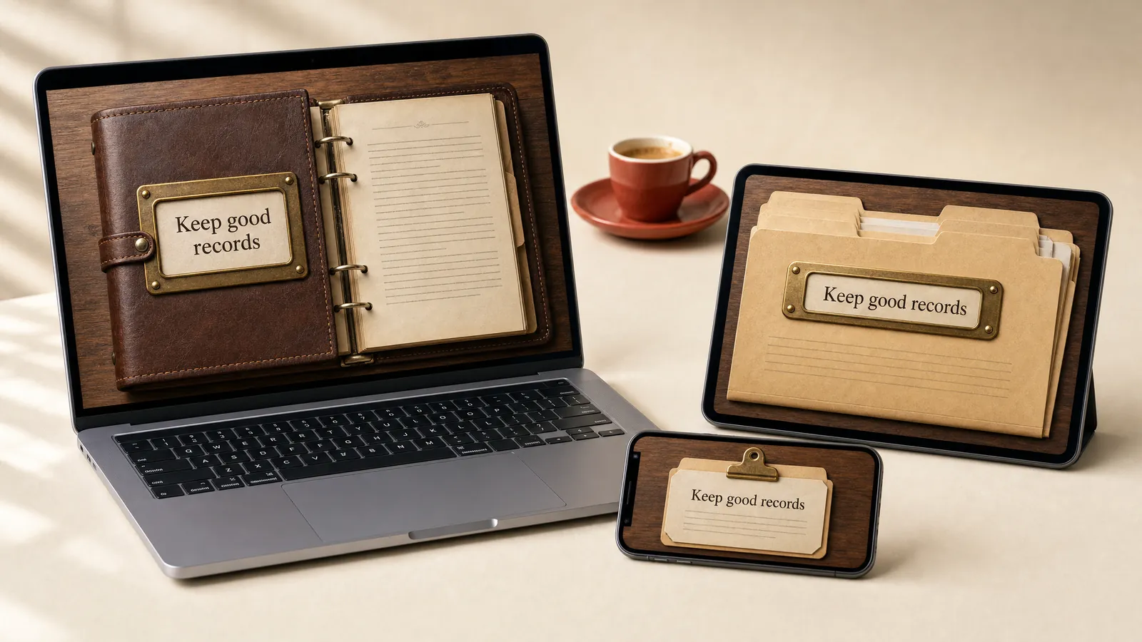
Skeuomorphism makes screens look like real objects, and Apple used it until iOS 7 in 2013. It suits activities that mirror a real register, form or tool. Keep the textures light for slow connections.
Neumorphism.
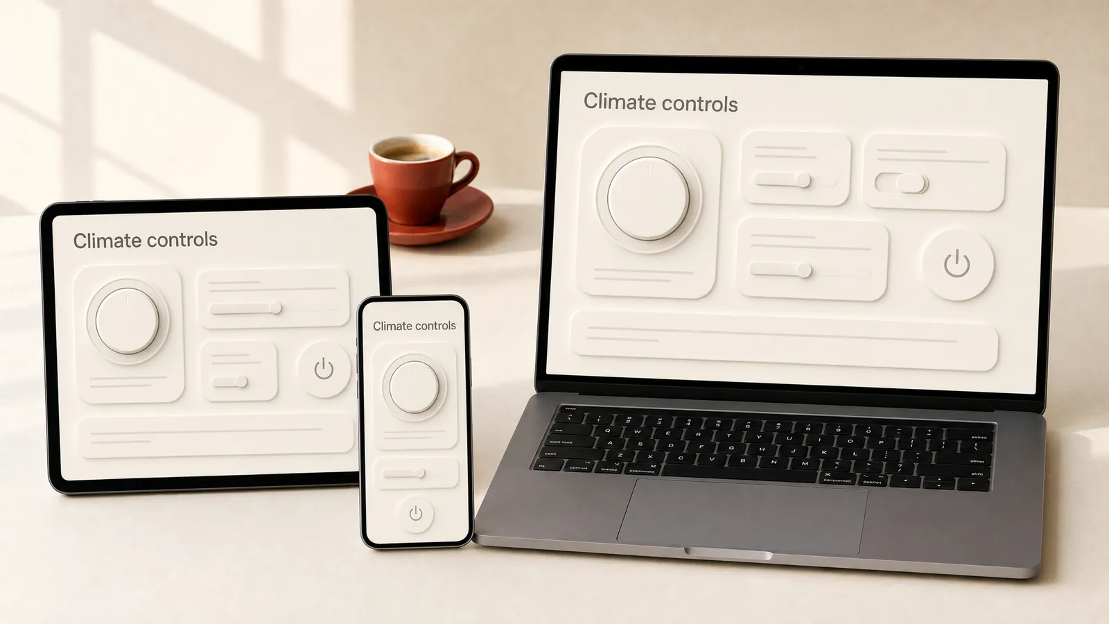
Neumorphism, named in 2019, makes controls look pressed into or raised out of the background with soft shadows. It suits simple control panels with only a few buttons. Its low contrast is a known weakness, so test every control.
Glassmorphism.
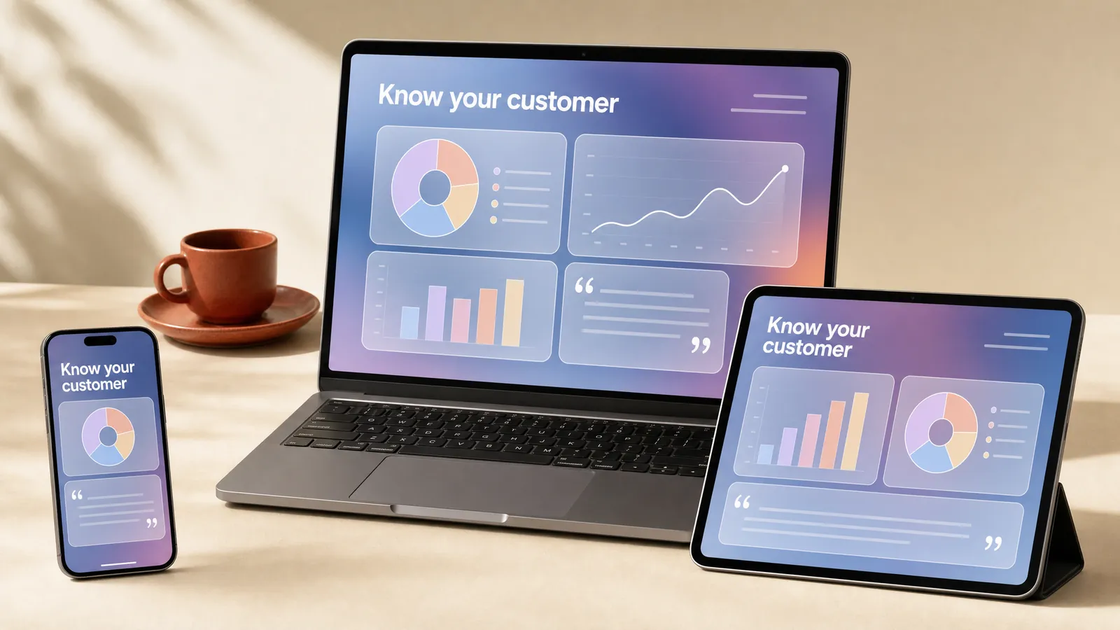
Glassmorphism, named in 2020, layers frosted see-through panels over colour, and Apple’s Liquid Glass brought it back in 2025. It suits data and technology courses. Raise the panel opacity until the text passes contrast.
Neo-brutalism.
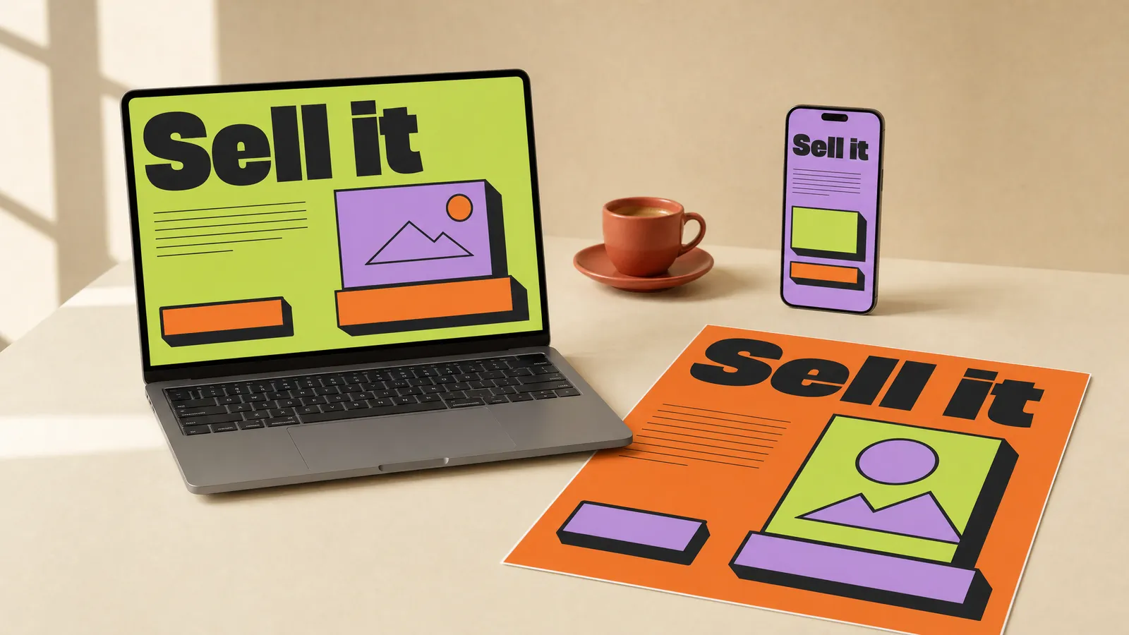
Neo-brutalism grew out of brutalist web design, with thick black outlines, flat bright colours and hard shadows. It suits sales and product training for people who want it fast and direct. Save the thickest outlines and hardest shadows for the buttons people press.
Y2K aesthetic.
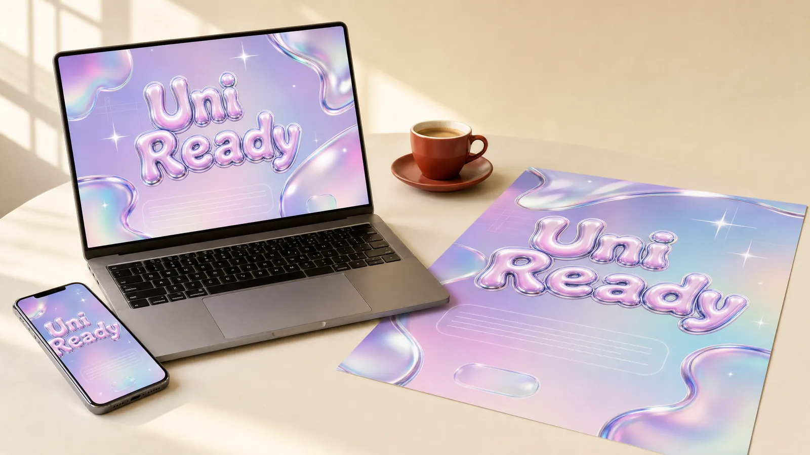
The Y2K look comes from late 1990s and early 2000s products such as the see-through iMac G3, and it came back in the 2020s. It suits orientation for younger learners. Pick one or two of its motifs, because all of them at once looks like a costume.
Frutiger Aero.
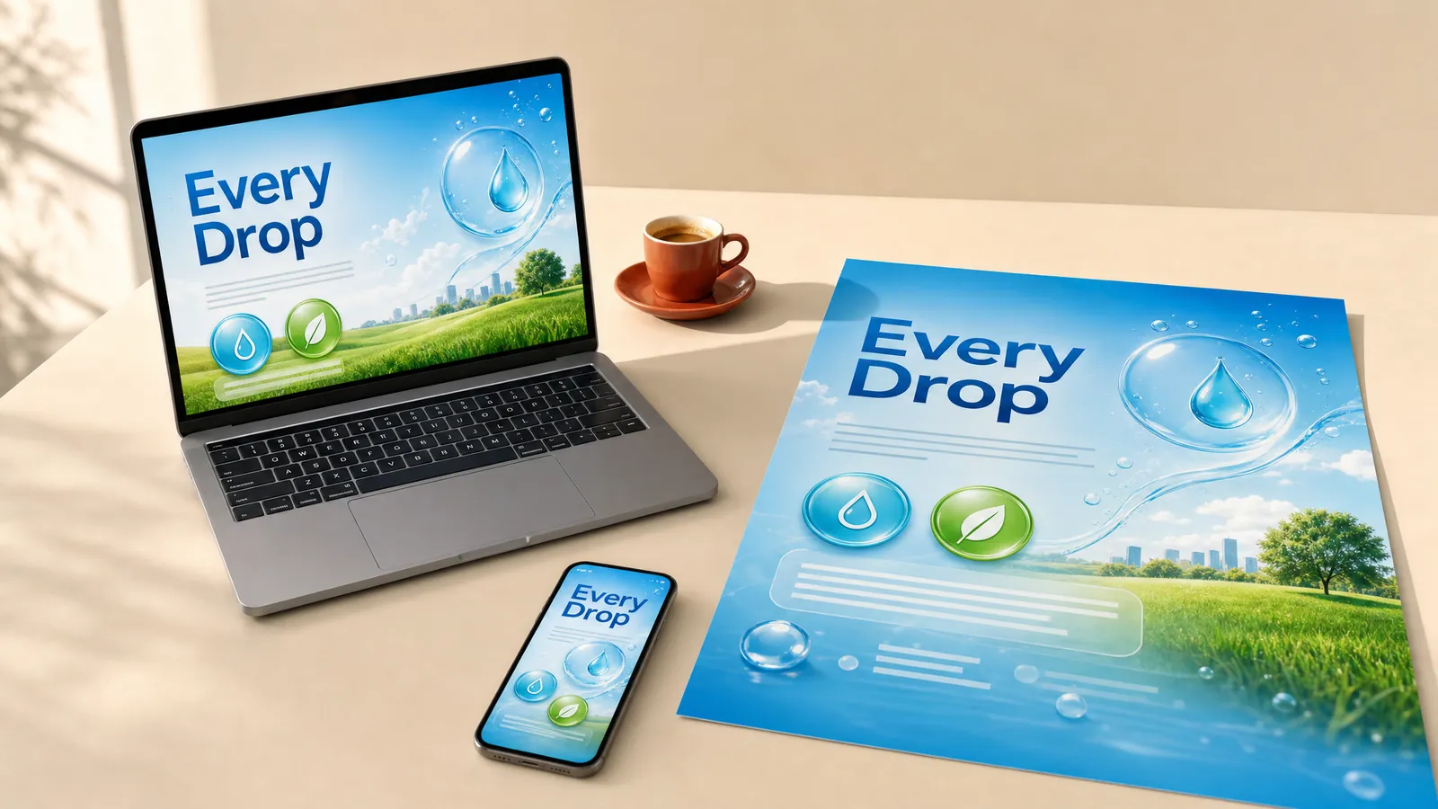
Frutiger Aero is the glossy look of mid-2000s computers, named in 2018: aqua glass, bubbles and blue skies. It suits water and environment topics. Keep the gloss on buttons and icons, and set text on flat panels.
Synthwave.
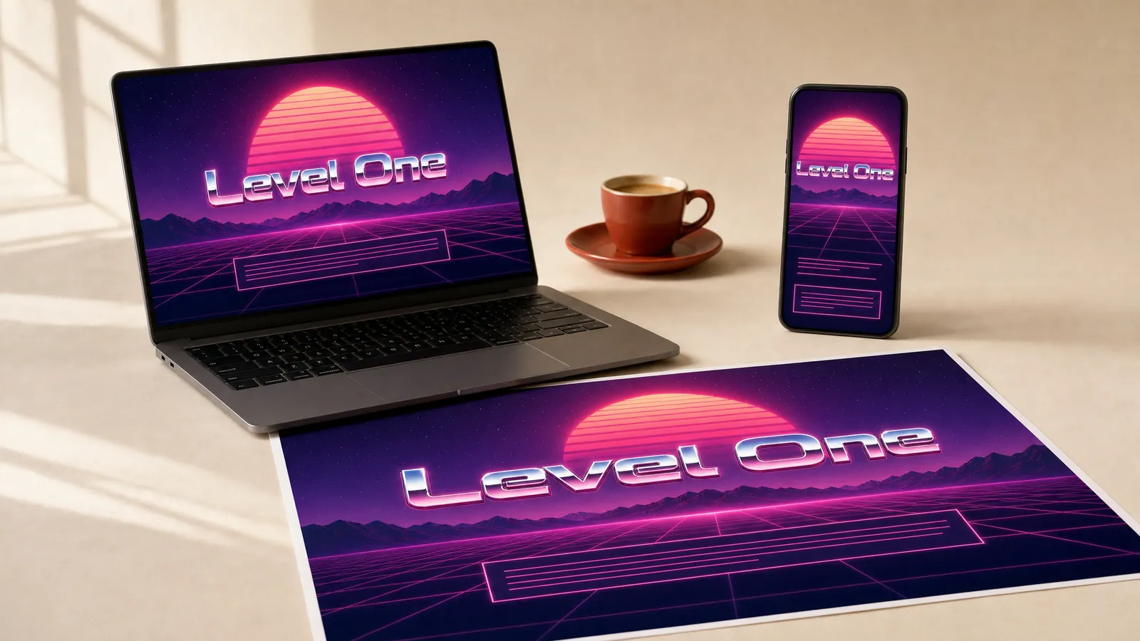
Synthwave began as a music genre in the late 2000s, with neon sunsets, glowing grids and chrome lettering. It suits title screens for tech and gaming audiences. Test the glow on a projector as well as a screen.
Cyberpunk.
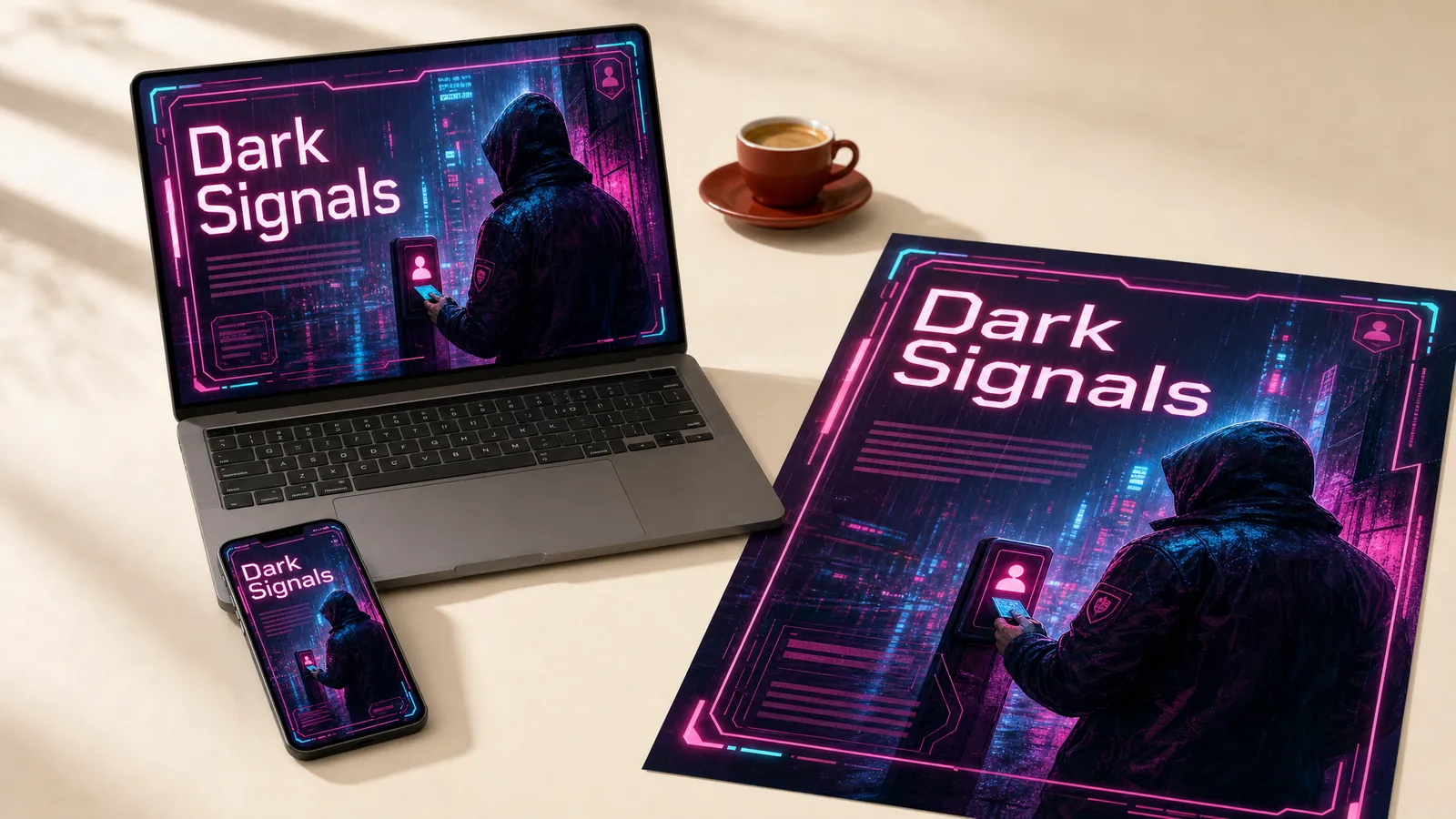
Bruce Bethke coined the word cyberpunk in 1983, and Blade Runner gave it its rainy neon look. It suits cyber security scenarios where the setting signals threat. Test every neon colour against the dark background.
Glitch art.
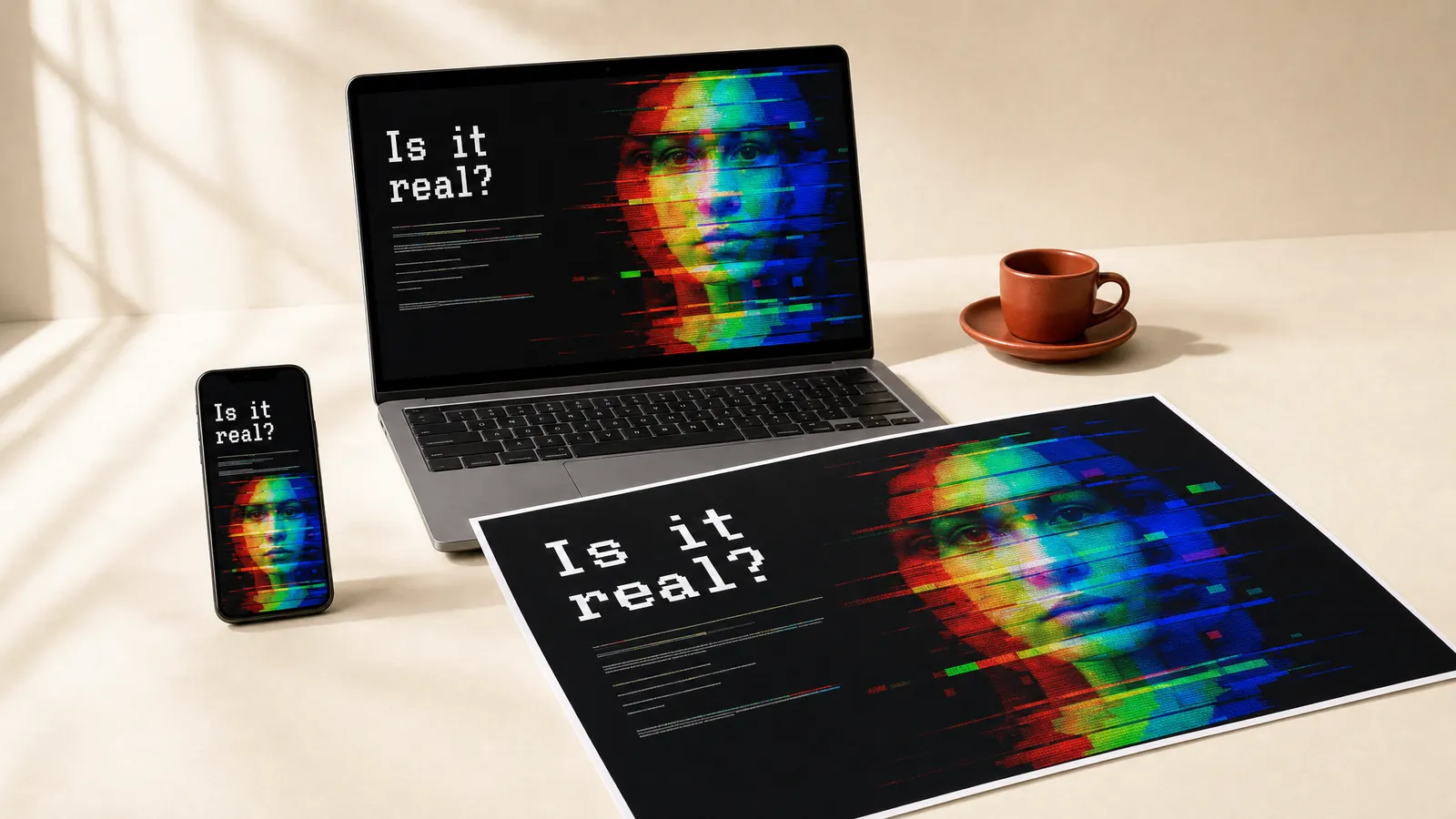
Glitch art turns digital errors into decoration, from Nam June Paik’s distorted televisions in 1965. It suits title screens for AI literacy and misinformation modules. Keep body text steady, and keep the glitch still or slow.
How do you choose a design style? Five steps.
- Start with the learner and the device. A shift worker on a phone needs a different style from a manager at a desk.
- Check the brand guide. Find out which colours, fonts and image rules are fixed and which are flexible.
- Pick one main style. Borrow a second style for one moment at most, such as a comic scenario inside a flat course.
- Test it on three pieces. Try the style on one screen, one page and one slide, then show learners before you build the rest.
- Write it down. Record the colours, type, layout and image rules as a style guide, so every new module matches.
How have we used design styles in our own work?
Challenge DV: we designed it to feel human.
When we moved Challenge DV’s workplace domestic and family violence workshop online, our design call was a story-driven course that felt warm and human. Over four months we built it in Chameleon Creator, with scenarios, self-reflections and voiceover in an accessible design. On a topic this personal, a cold corporate style would have kept learners at arm’s length.
We build style guides, and we work inside yours.
Your organisation probably has a brand guide already, and we build style guides for clients so every course and workbook looks like one family. A brand guide rarely rules out the styles above. There’s usually room to play around the edges. Keep the brand colours and fonts, then borrow a comic layout for a scenario or a blueprint look for a job aid. As Naomi, one of our senior instructional designers, puts it, “Lean into the branding. That’s your point of difference. We might use icons similar to other courses, but people don’t notice once everything is coherent and applied in the right way.” See how we approach graphic design and branding, and read more about visual design in learning.
Find the style your learners will open.
Book a 45-minute call and we’ll talk through which styles suit your learners and your brand.
Book a callWhen is a design style the wrong answer?
A style can’t fix content that’s wrong, too long or aimed at the wrong people. When the problem is the content, start with the design of the learning, then dress it.
A style is also wrong when it fights the brand guide you must follow, or fails the contrast and flashing checks. It’s wrong, too, when the team picked it and learners never tried it. In each case, go back to step one and test with learners.
FAQs
Choose the style that serves the learning.
The best design style is the one your learners open, follow and remember, inside the brand your organisation already has. It’s horses for courses, so taste widely, then order one main course.
Hungry Minds designs and builds eLearning, workshop kits and campaigns, with the graphic design and branding to match. See more styles at work on our showcase.
References
- Lindgaard, G., Fernandes, G., Dudek, C., and Brown, J. (2006). Attention web designers: You have 50 milliseconds to make a good first impression! Behaviour and Information Technology, 25(2), 115 to 126. https://doi.org/10.1080/01449290500330448
- Fogg, B. J., Soohoo, C., Danielson, D. R., Marable, L., Stanford, J., and Tauber, E. R. (2003). How do users evaluate the credibility of Web sites? A study with over 2,500 participants. Proceedings of DUX 2003, ACM. https://doi.org/10.1145/997078.997097
- Lester, J. C., Converse, S. A., Kahler, S. E., Barlow, S. T., Stone, B. A., and Bhogal, R. S. (1997). The persona effect: affective impact of animated pedagogical agents. Proceedings of CHI 97, ACM, 359 to 366. https://doi.org/10.1145/258549.258797
- Mayer, R. E. (2020). Multimedia Learning, third edition. Cambridge University Press. https://doi.org/10.1017/9781316941355
- Mayer, R. E. (2024). The past, present, and future of the cognitive theory of multimedia learning. Educational Psychology Review, 36, article 8. https://doi.org/10.1007/s10648-023-09842-1
- World Wide Web Consortium (2024). Web Content Accessibility Guidelines (WCAG) 2.2. https://www.w3.org/TR/WCAG22/

Michael Peart
Managing Partner, Hungry Minds
Michael Peart is Managing Partner and Senior Learning Designer at Hungry Minds, an Australian learning design consultancy. If you’ve asked us about a new program, you’ve met Michael. He turns your business goal into a sharp learning strategy, then drives it all the way to results.
