
Why we sometimes put characters in eLearning
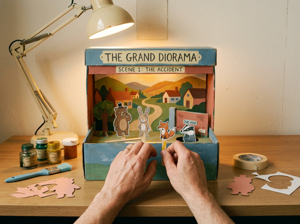
We use characters in eLearning only when they do a real job: modelling behaviour, carrying scenarios or showing consequences. Here is how we decide.
Read moreVisual design in learning is not decoration. It is a cognitive tool. The right visual reduces load, directs attention and makes complex information land faster than text ever could. The wrong visual adds noise and slows comprehension.
This hub, part of the Hungry Minds learning resources library, covers how to use layout, illustration, typography, colour and multimedia to make learning clearer, faster and more memorable. Built for learning designers, graphic designers working in L&D, and anyone commissioning eLearning who wants it to look good and teach well.
We use characters in eLearning only when they do a real job: modelling behaviour, carrying scenarios or showing consequences. Here is how we decide.
Read moreLet’s talk about how your learning looks. Because it matters more than most people think. When people see poor visual design, they tune out. When design…
Read moreAs we navigate the intricate dance between digital and traditional pedagogies, we're drawn to a beacon of modern education: blended learning.
Read moreNeed help with visual design for learning?
Let’s talkWe turned Clare Valley's service promise into a pick-and-mix learning campaign for cellar door teams, with eLearning, podcasts and job aids. See how.
Read articleVisual design for learning is the deliberate use of graphics, layout, typography, colour, illustration and multimedia to support comprehension, retention and engagement in educational content. It applies principles from cognitive science (dual coding, signalling, spatial contiguity) to design decisions that most people think are purely aesthetic.
A well-designed eLearning module is not just prettier. It is easier to learn from. The layout tells the eye where to go. The illustrations explain what the text cannot. The whitespace gives working memory room to process. Every visual choice either helps the learner or gets in the way.
We treat visual design as a learning design discipline, not a finishing step. Our designers work alongside instructional designers from the start, shaping how information is structured visually so the learner can process it. That is the difference between a course that looks polished and a course that teaches.
Research is clear: visuals are not a nice-to-have in learning. They are a primary channel for understanding. Mayer’s multimedia learning principles, dual coding theory and cognitive load research all converge on the same finding: well-designed visuals improve learning outcomes. Poorly designed visuals actively harm them.
Every unnecessary visual element increases extraneous cognitive load. Every purposeful visual reduces intrinsic load by offloading complexity from text to image. Good visual design is the single fastest way to make difficult content feel manageable.
When information is presented as both words and images, learners form two memory traces instead of one. That means better recall, stronger transfer and more durable learning. But only when the visual genuinely represents the content, not when it is decorative clip art filling space.
The eye goes where design tells it to go. Colour, contrast, size, position and motion are all signalling tools that direct attention to what matters. Without deliberate signalling, learners waste effort figuring out where to look before they can figure out what to learn.
Design quality signals credibility. A poorly designed course tells the learner (often unconsciously) that the content is not worth their time. A well-designed course earns attention before the first interaction. That is not vanity. It is engagement strategy.
Visual design for learning draws on multiple specialisations. Knowing which one your project needs (and when to combine them) prevents both over-design and under-design.
Visual design for learning is not just graphic design applied to courses. It is design informed by research on how people process visual information during learning.
Richard Mayer’s research identifies specific principles for combining words and images: the multimedia principle (people learn better from words and pictures than words alone), the contiguity principle (place related text and images near each other), the coherence principle (remove extraneous material), and the signalling principle (highlight essential information). These are not suggestions. They are findings.
Presenting the same information in multiple overlapping formats (narration plus identical on-screen text plus an image of the same thing) does not reinforce learning. It overloads working memory. Remove redundant channels. Let each element do one job.
When presenting graphics, pair them with narration rather than on-screen text. This uses both the visual and auditory channels of working memory instead of overloading just one. It is one of the most robust findings in multimedia learning research, and one of the most frequently ignored in eLearning production.
Accessible design is not a separate checklist bolted on after the visuals are done. It is a design constraint from the start: sufficient contrast, text alternatives for images, captions for video, no colour-only meaning, readable font sizes, and keyboard-navigable interactions. Designing accessibility in from the beginning is cheaper and better than remediating afterwards.
Our visual designers are embedded in the learning design process, not brought in at the end to “make it look nice.” They work from the storyboard stage: shaping how information is structured visually, what needs illustration versus text, where whitespace supports processing, and how the screen layout reinforces the learning sequence.
We use Adobe Creative Suite, Figma and Canva for visual production. Articulate Rise 360, Storyline 360, Chameleon Creator and HTML for interactive builds. But the tool is never the starting point. The question is always: what does the learner need to see, and what is the clearest way to show it?
A safety induction for a mining site needs clear, unambiguous signage-style graphics that work on a tablet in bright sunlight. A leadership program for an insurance company needs sophisticated, brand-aligned visuals that signal credibility. A health literacy course for culturally diverse communities needs illustration styles tested for cultural appropriateness and low-literacy comprehension.
The visual approach adapts to the audience, the environment and the content. The principles stay the same: clarity, purpose and respect for how the brain processes visual information.
The things people ask us most. Got something else? We’re happy to chat.
Ask a questionYes. We create custom illustration, iconography, infographics and data visualisations tailored to the content and audience. Stock imagery works for some contexts, but when the visual needs to explain a specific process, concept or scenario, custom illustration always outperforms generic assets.